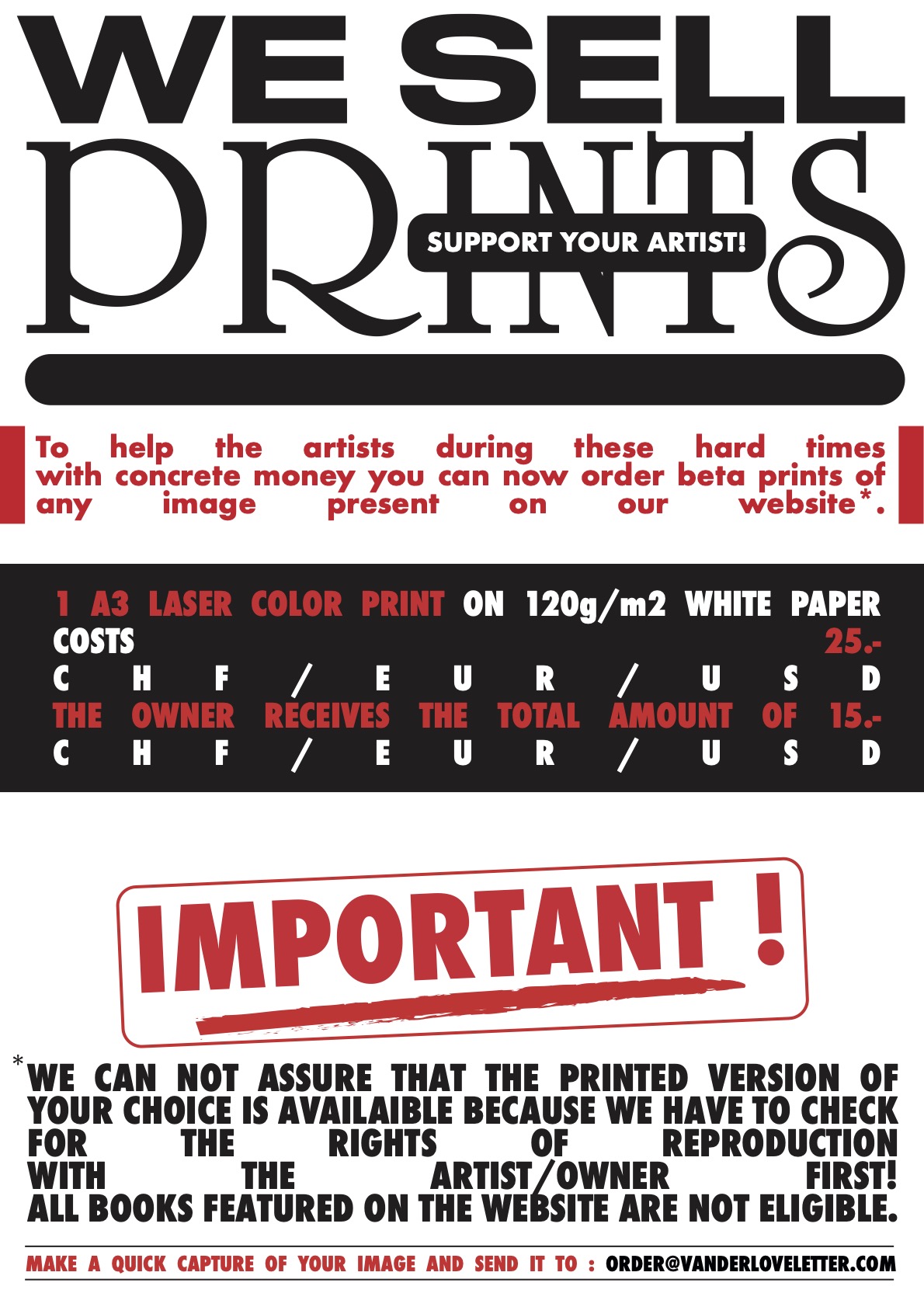
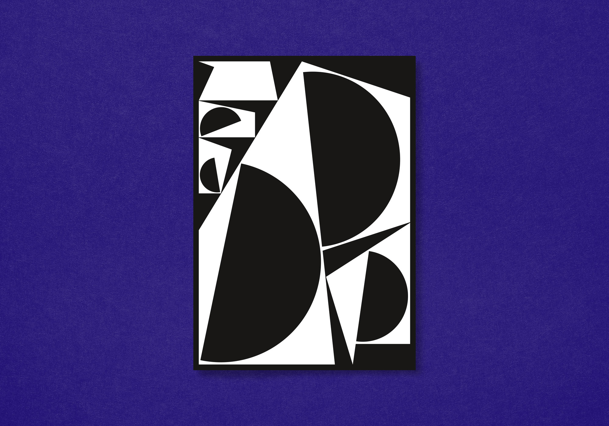
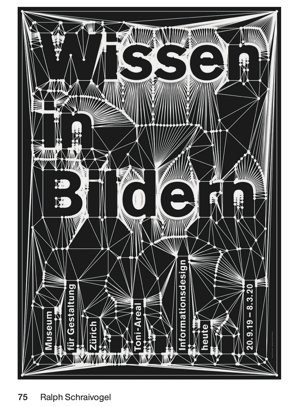
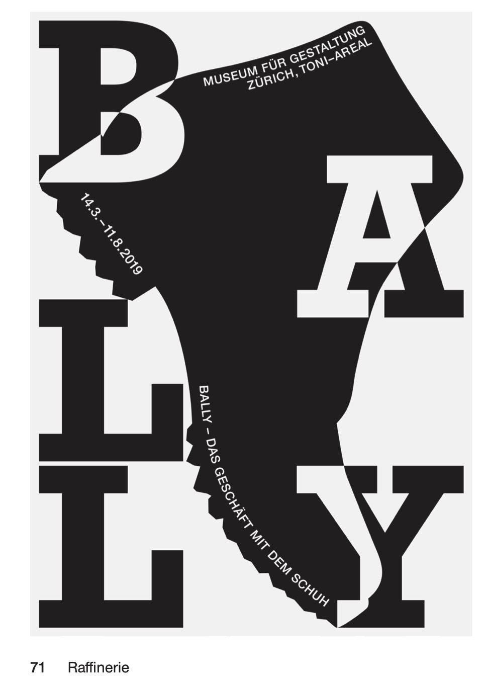
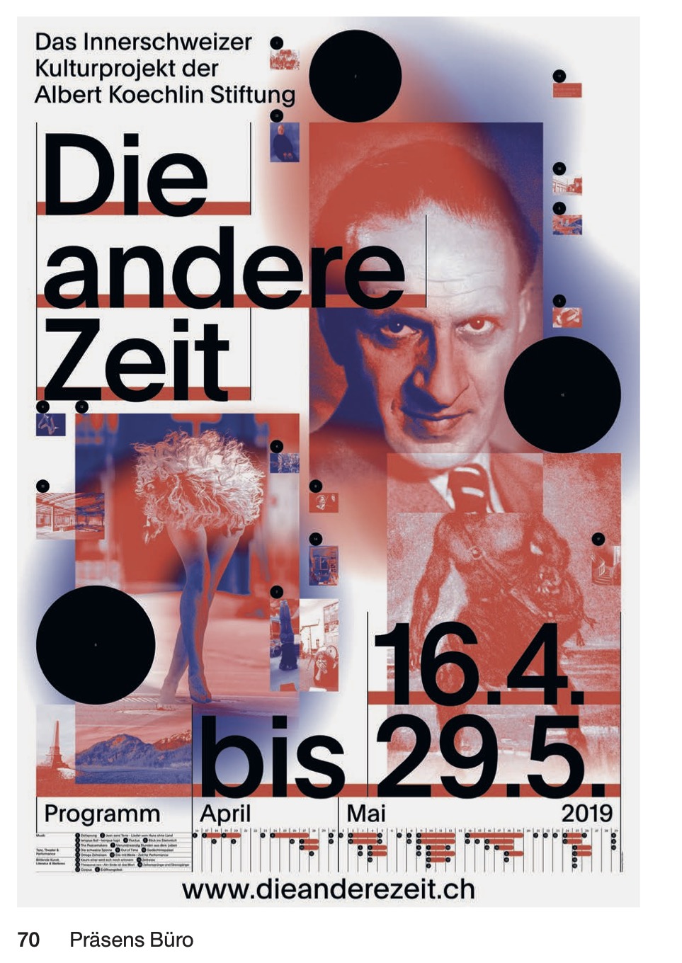
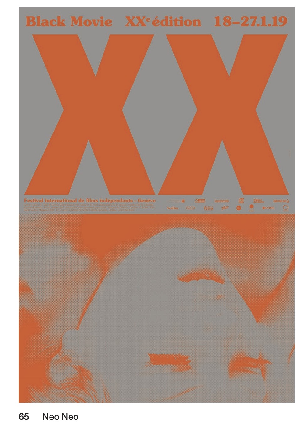
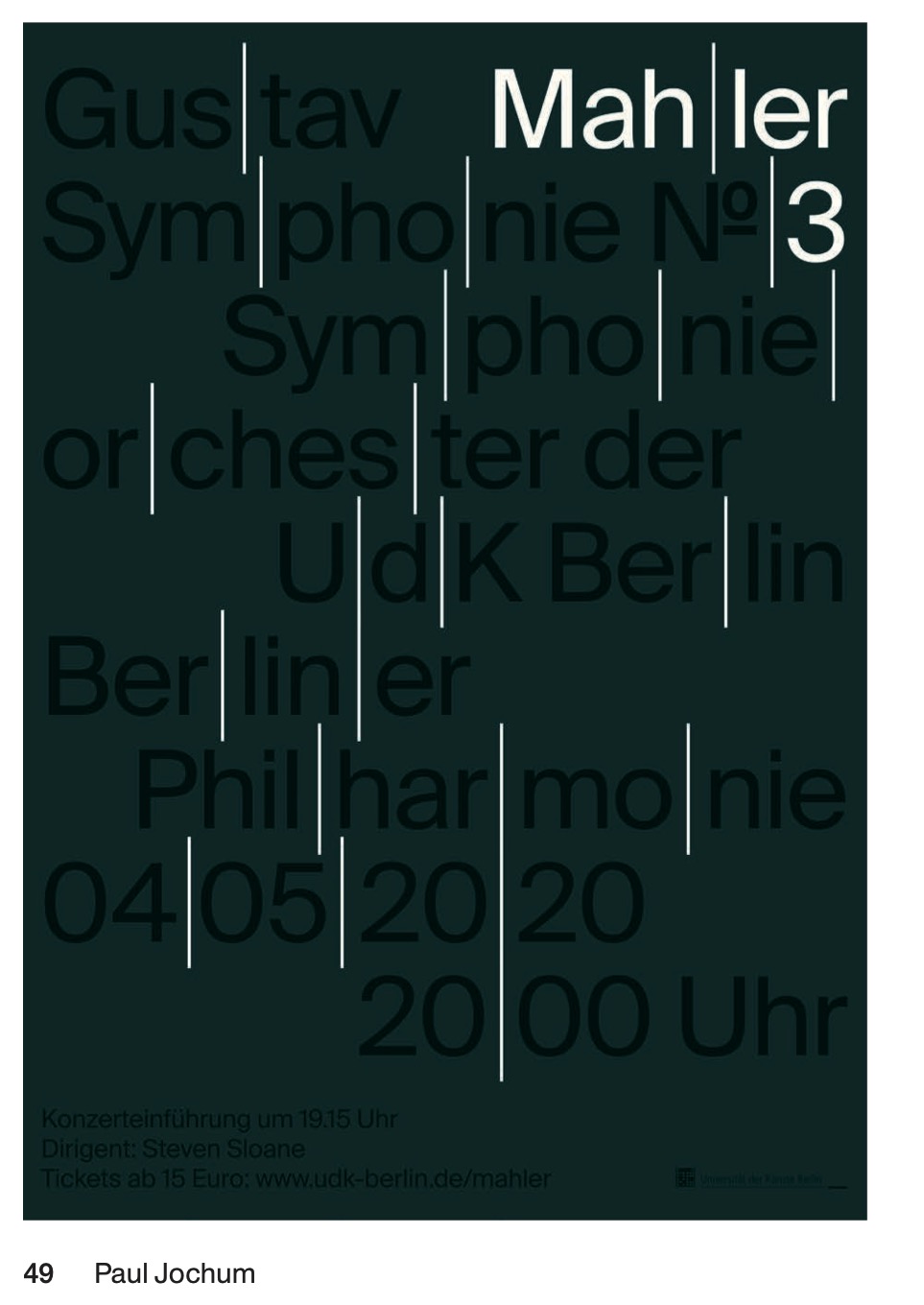
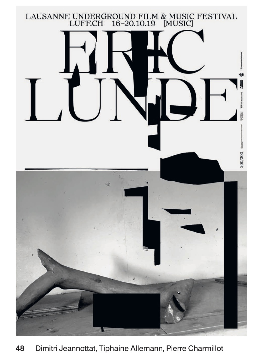
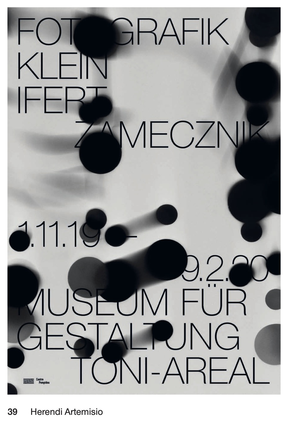
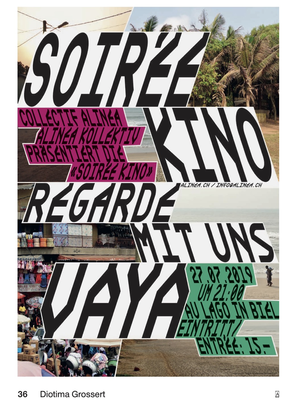
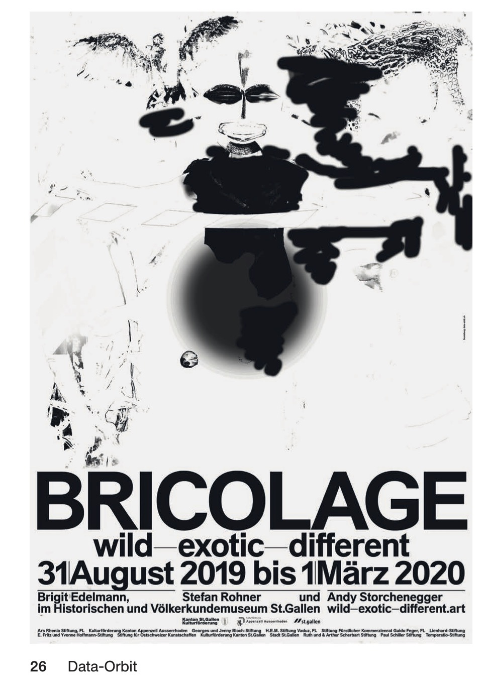
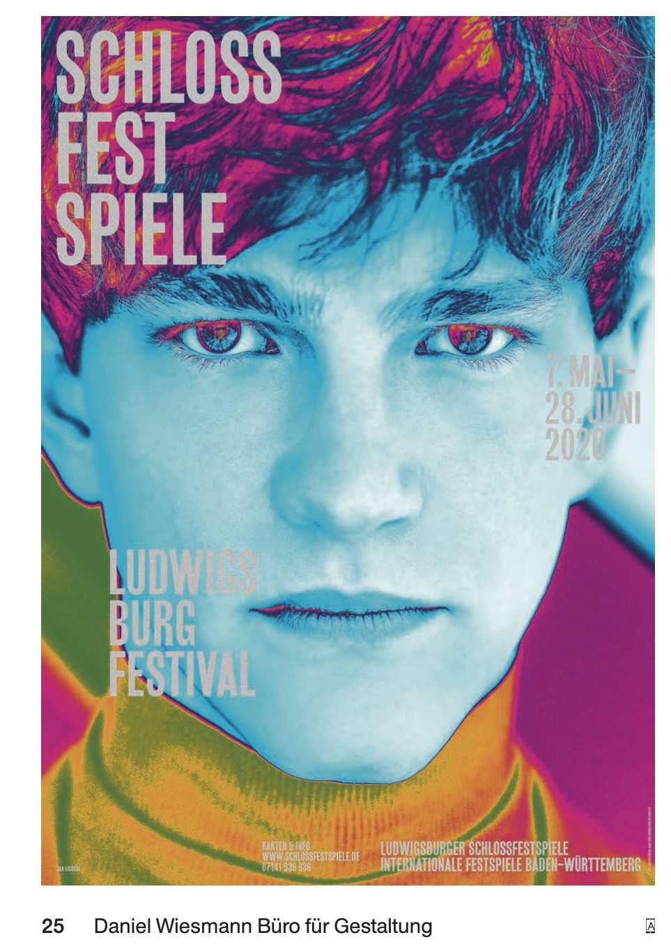
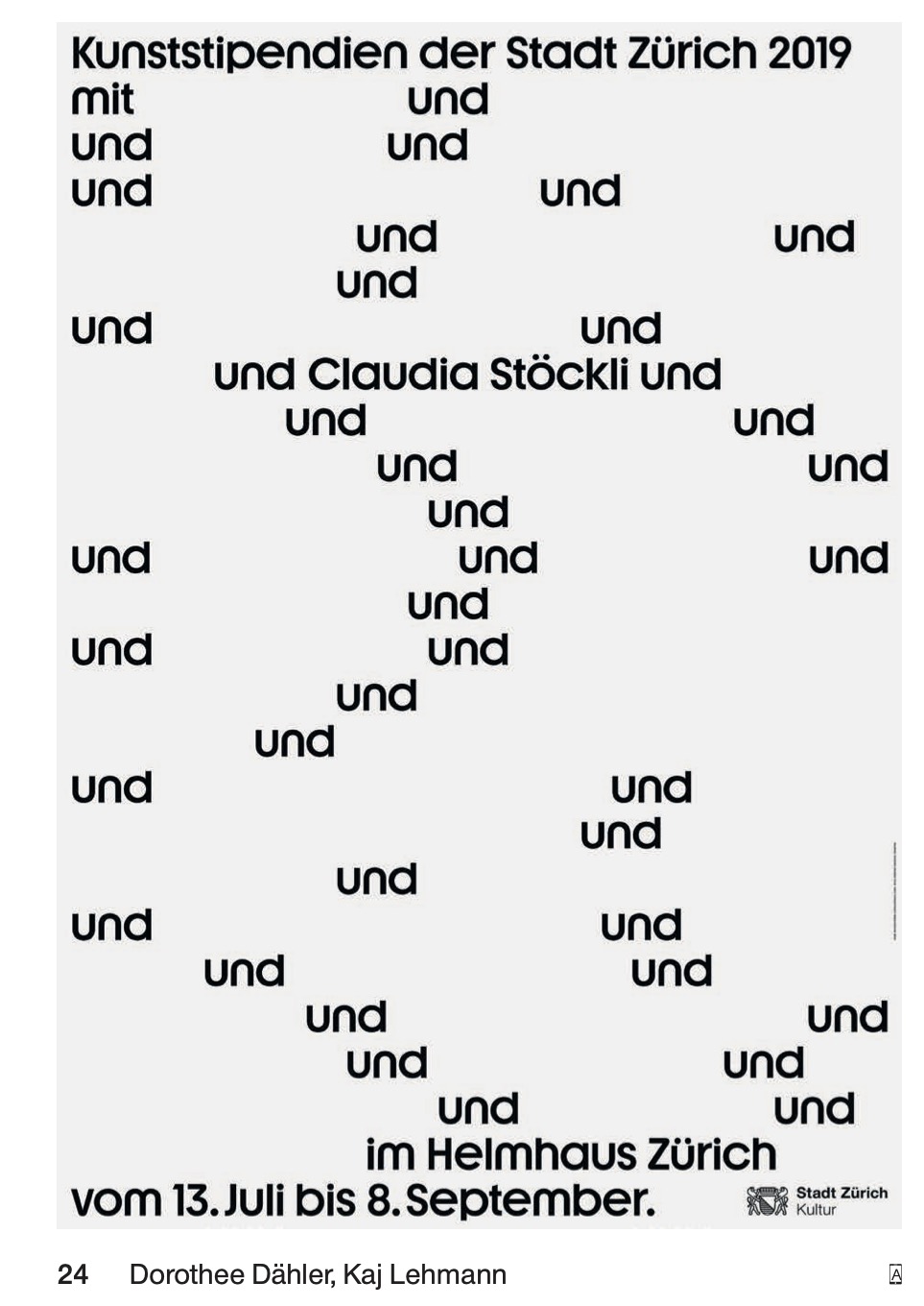
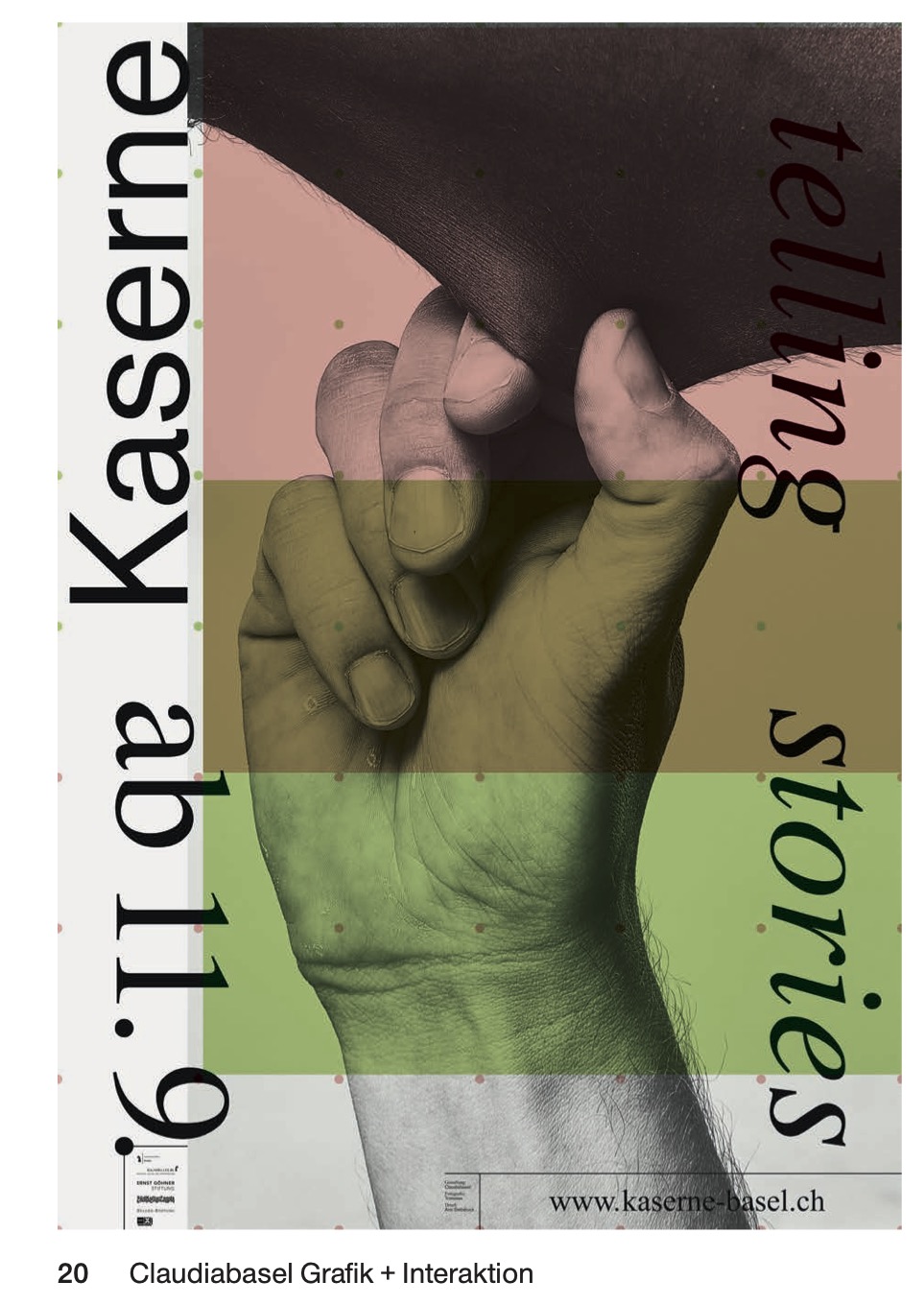
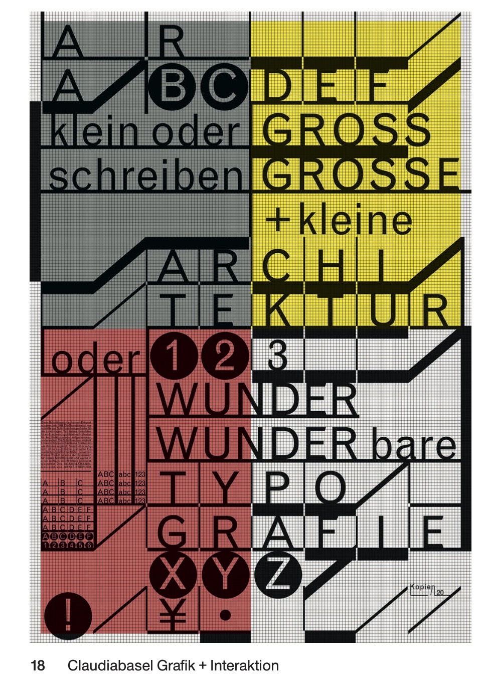
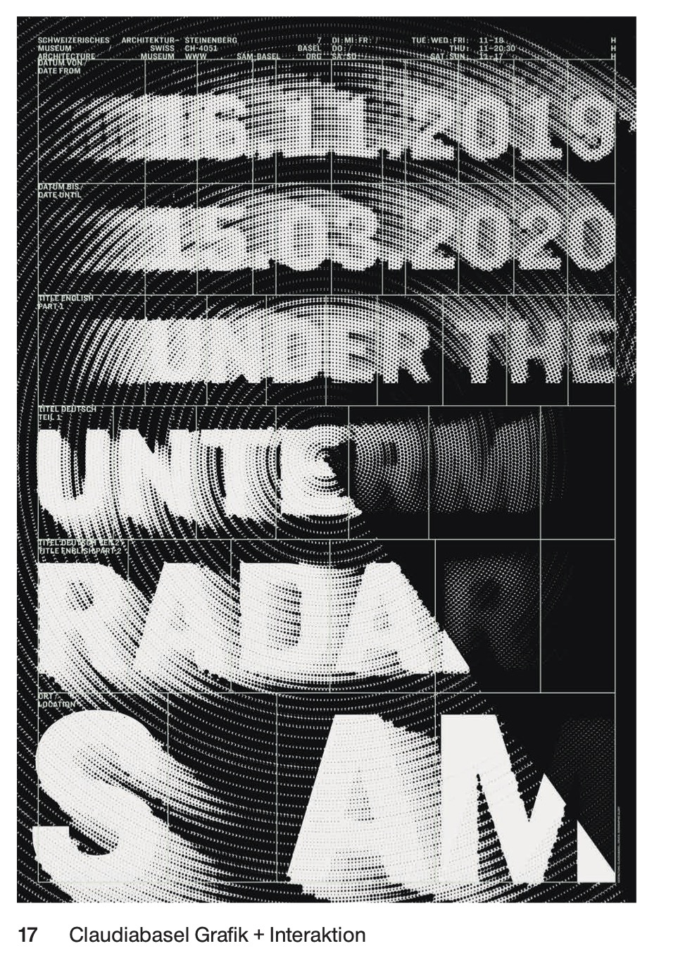
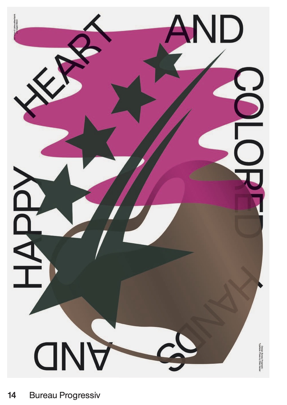
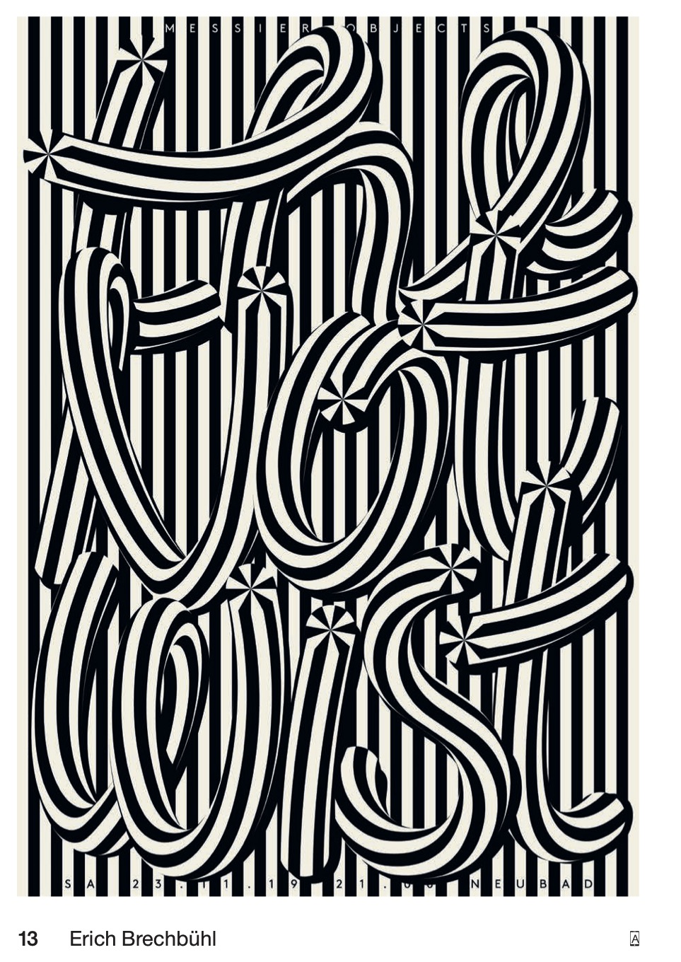
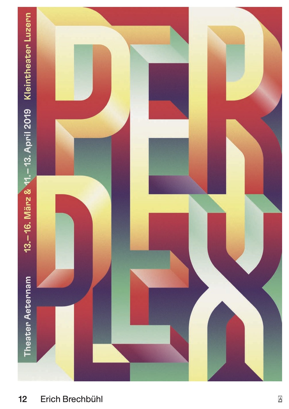
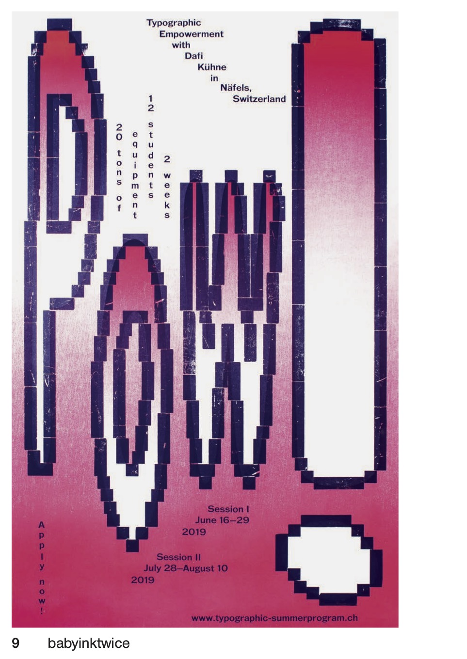
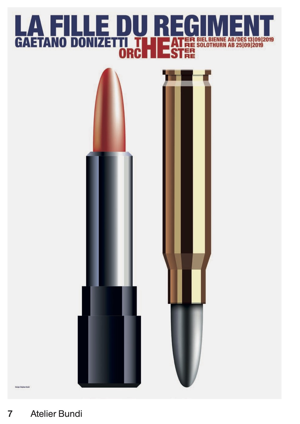
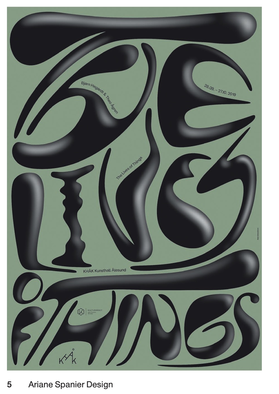
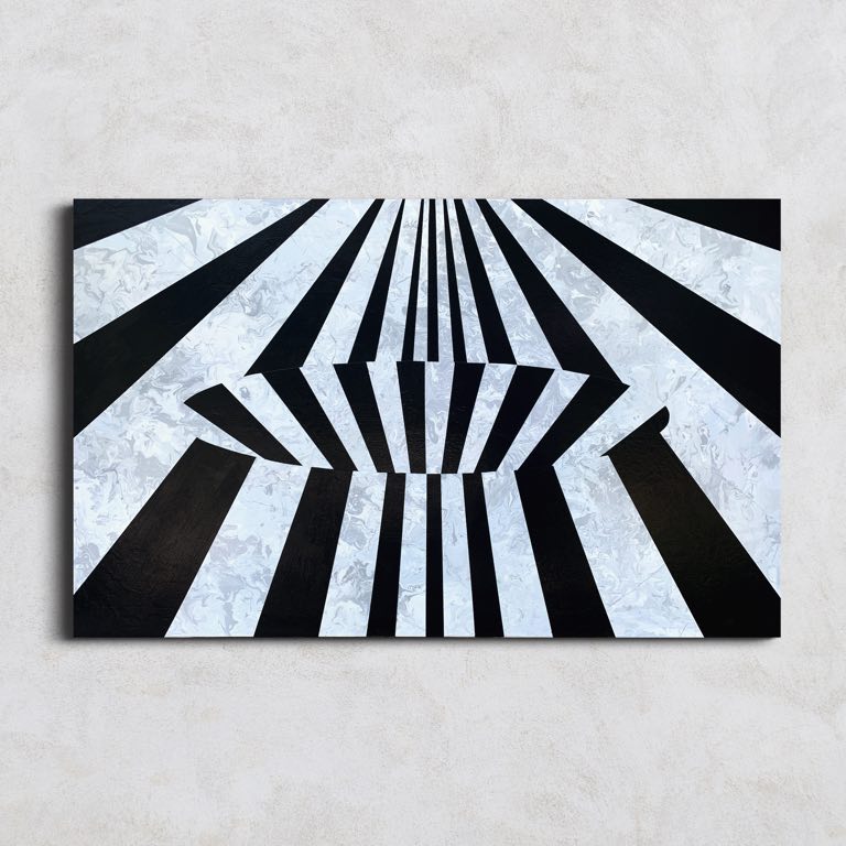
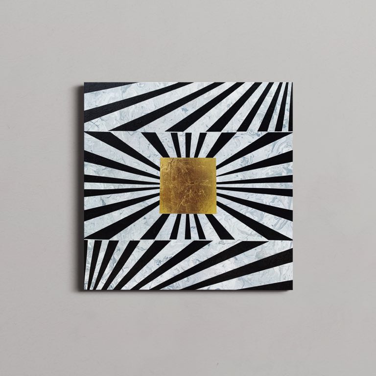
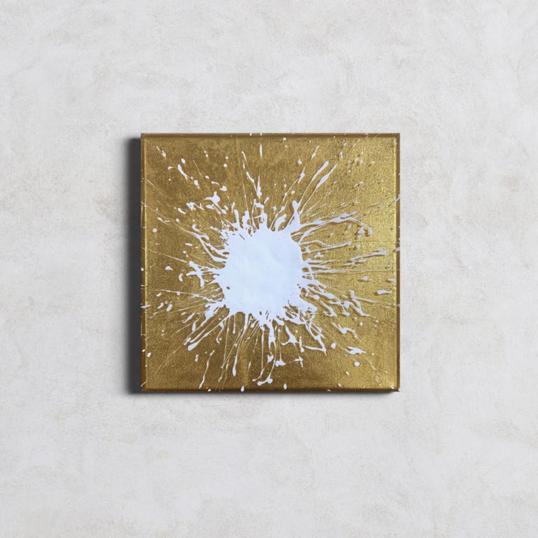
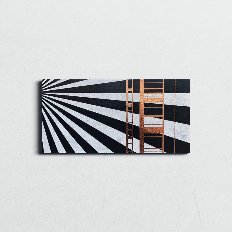
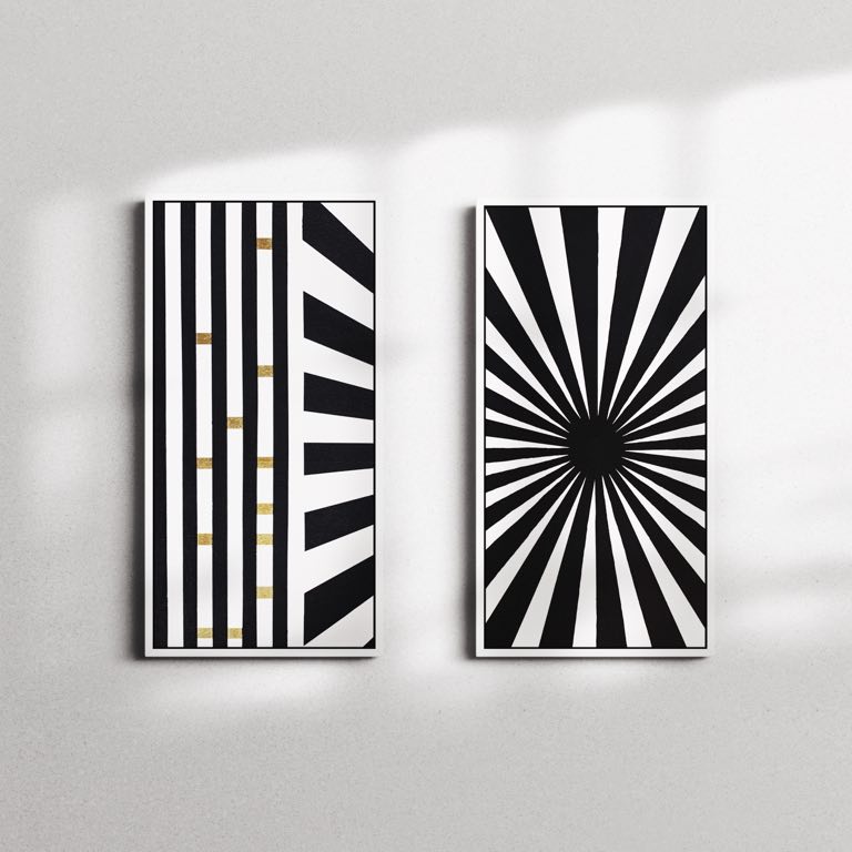
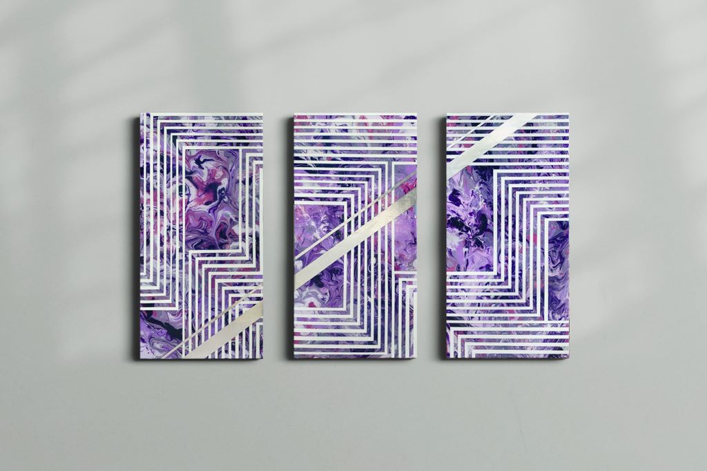
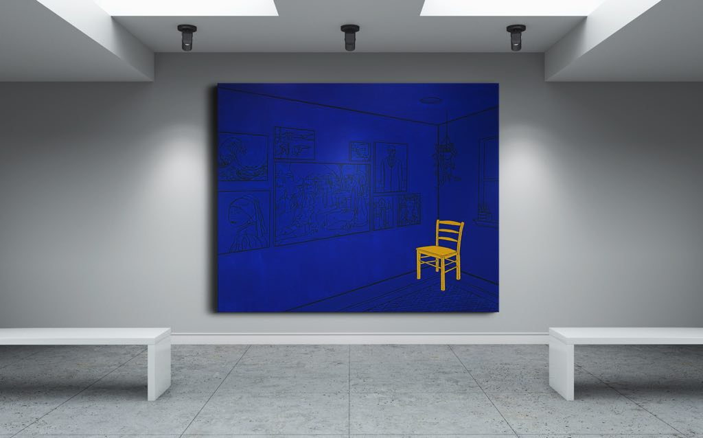
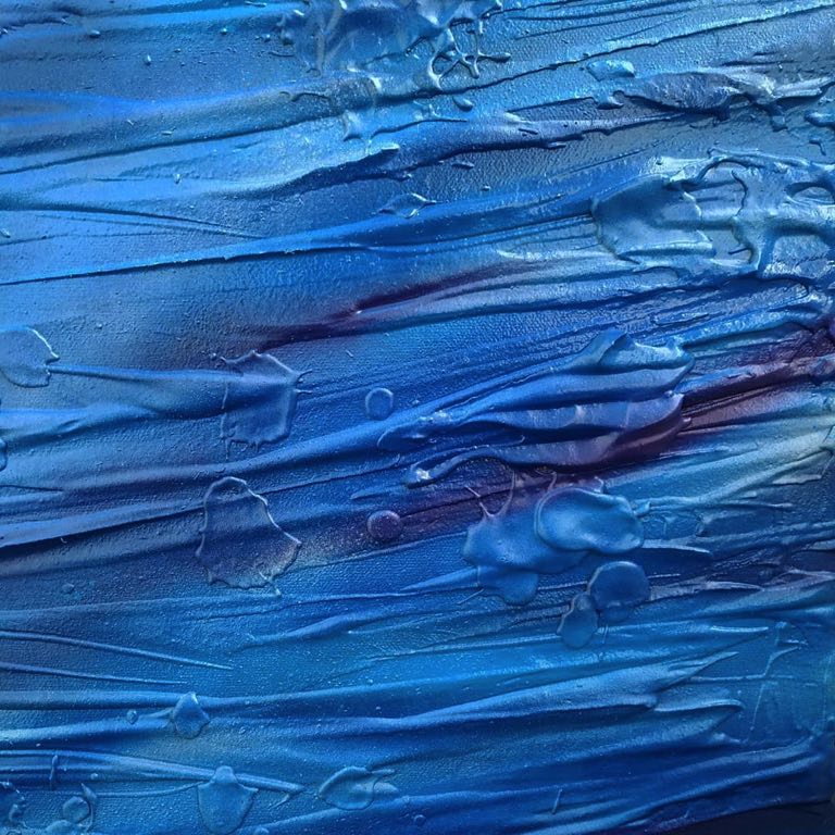
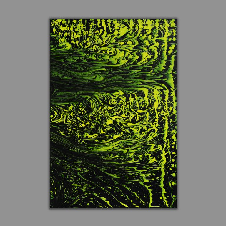
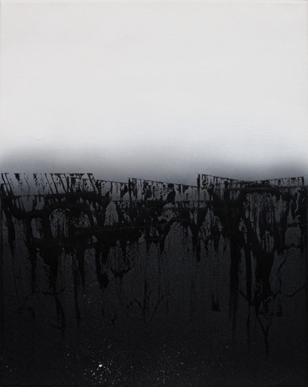
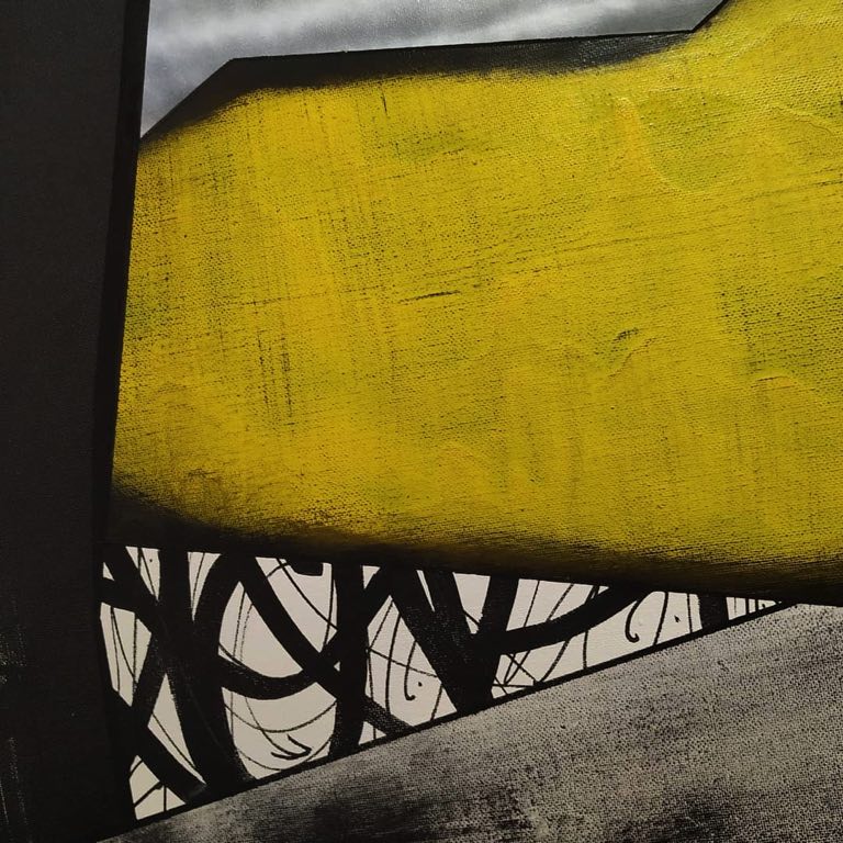
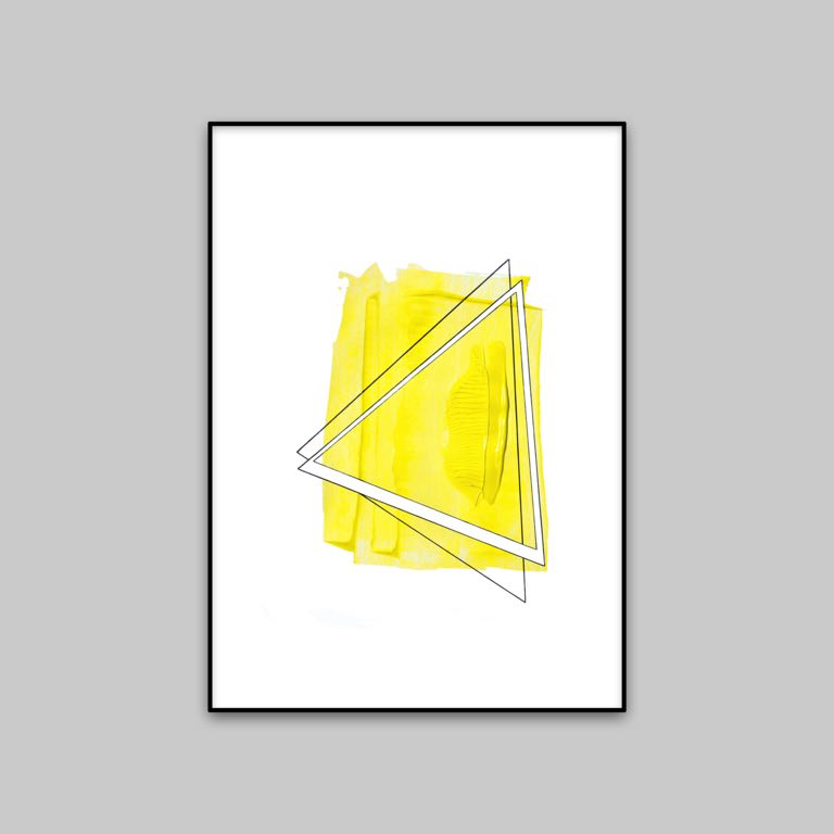
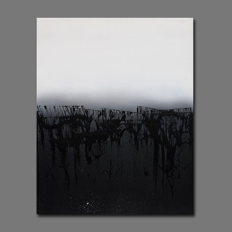
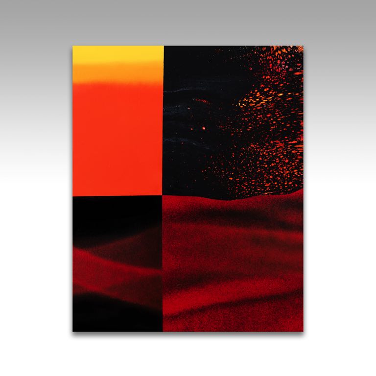
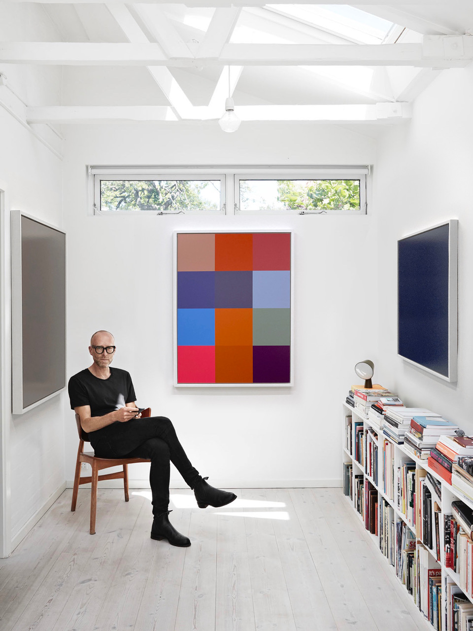
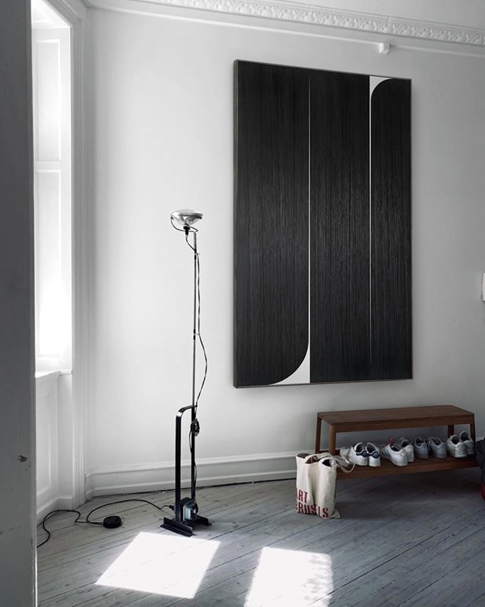
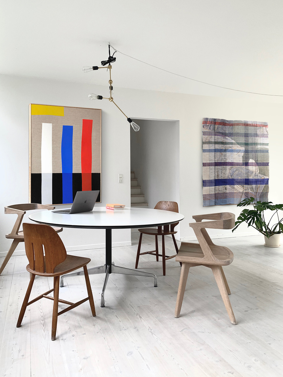
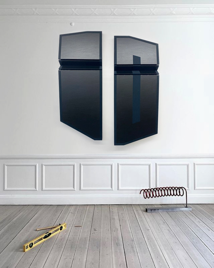
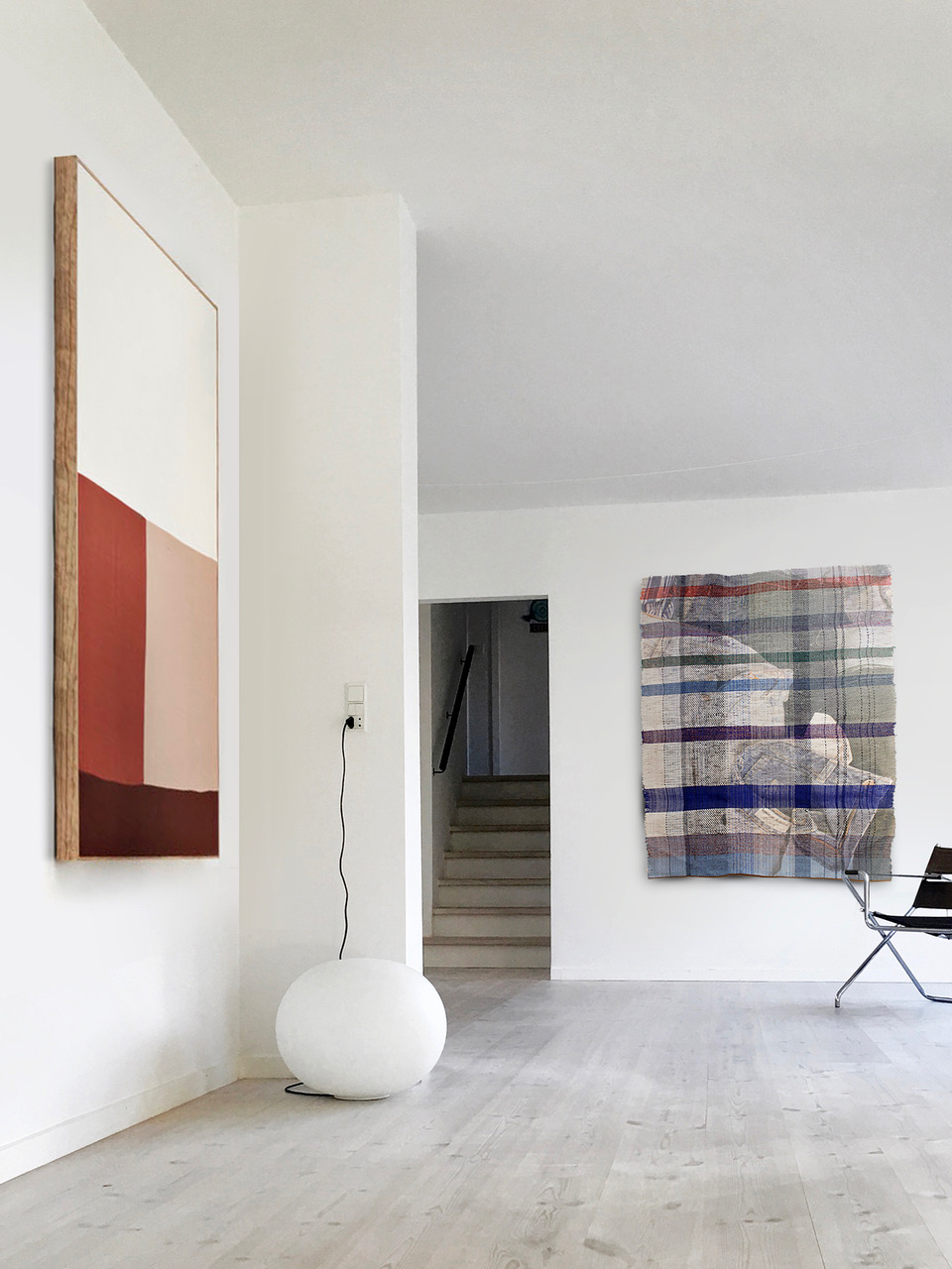
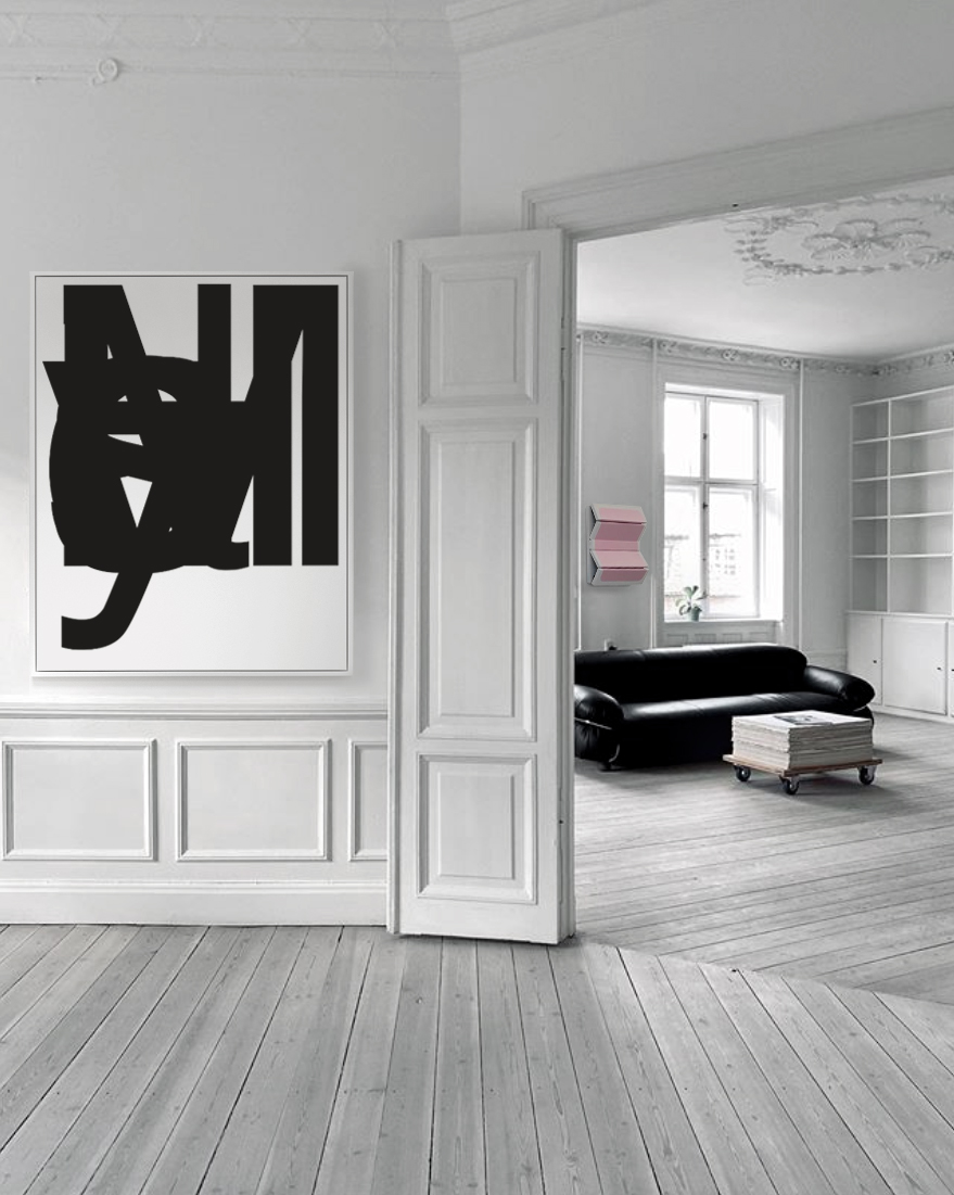
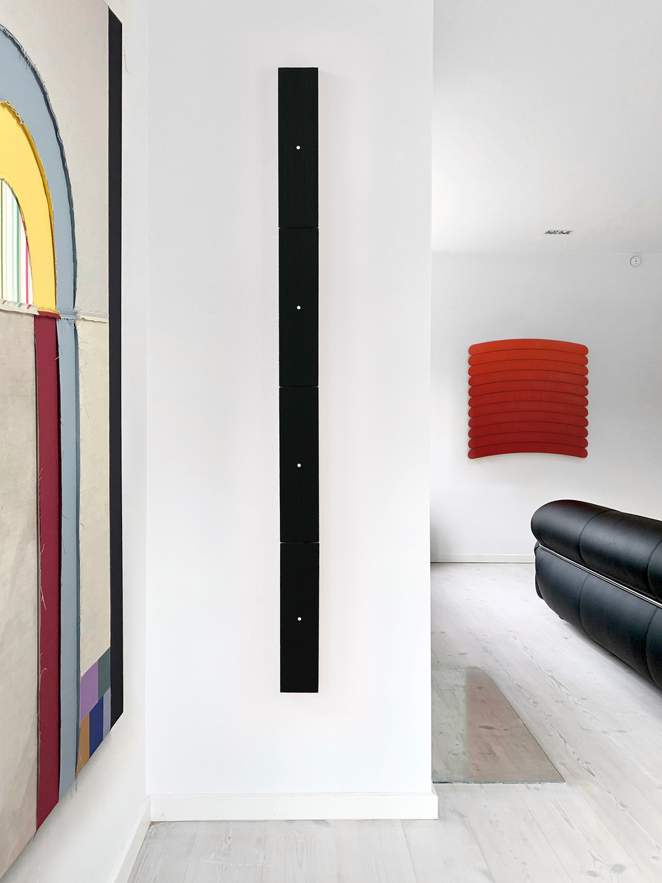
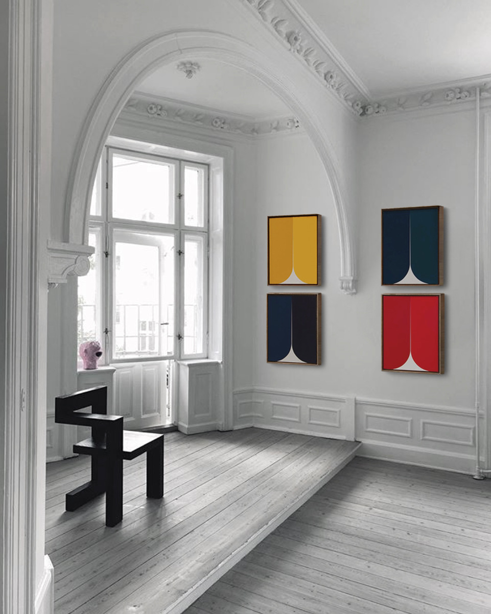
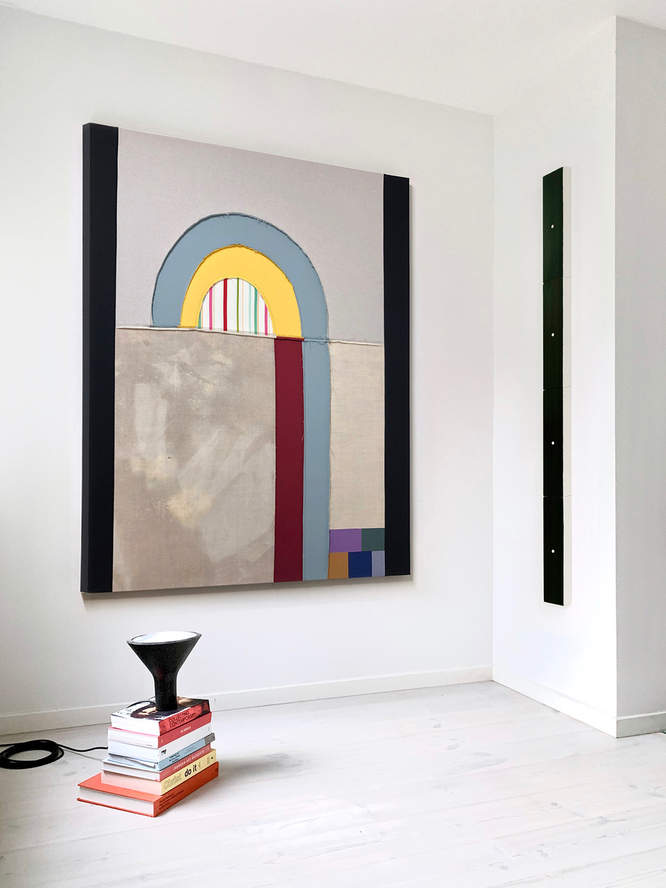
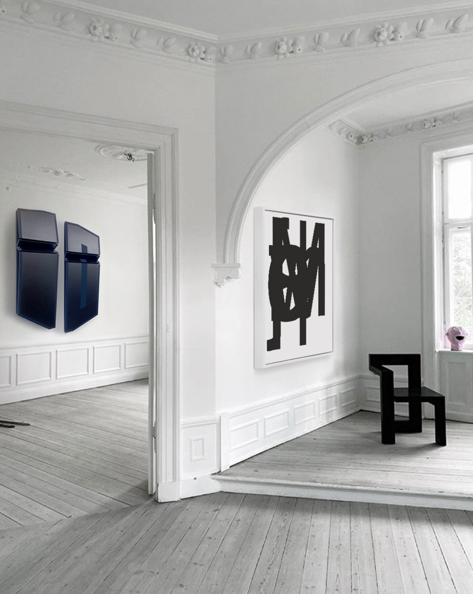
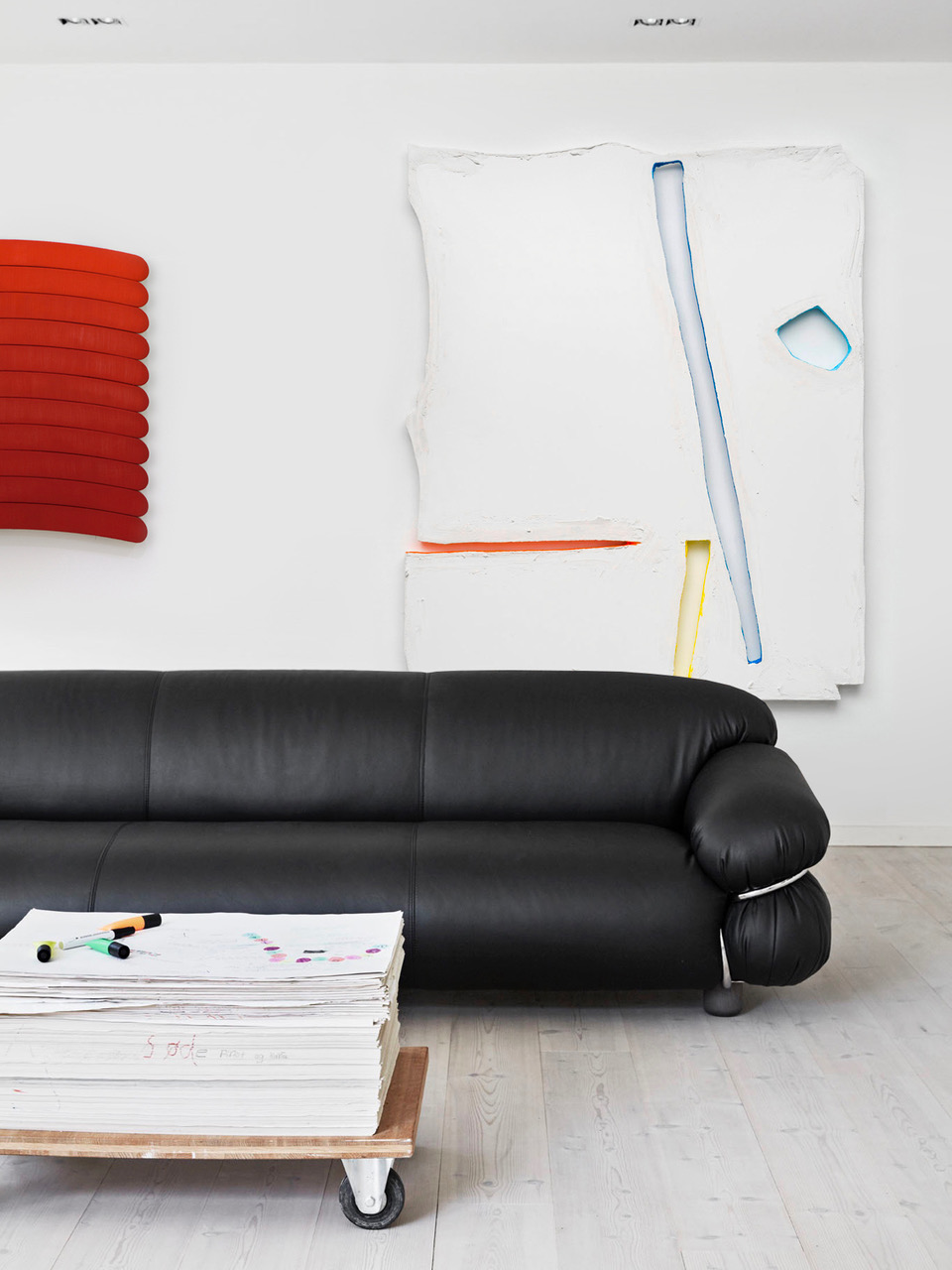
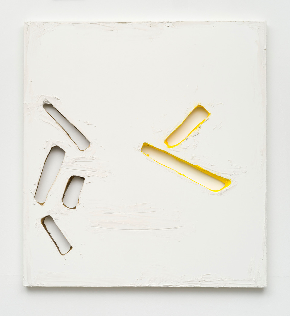
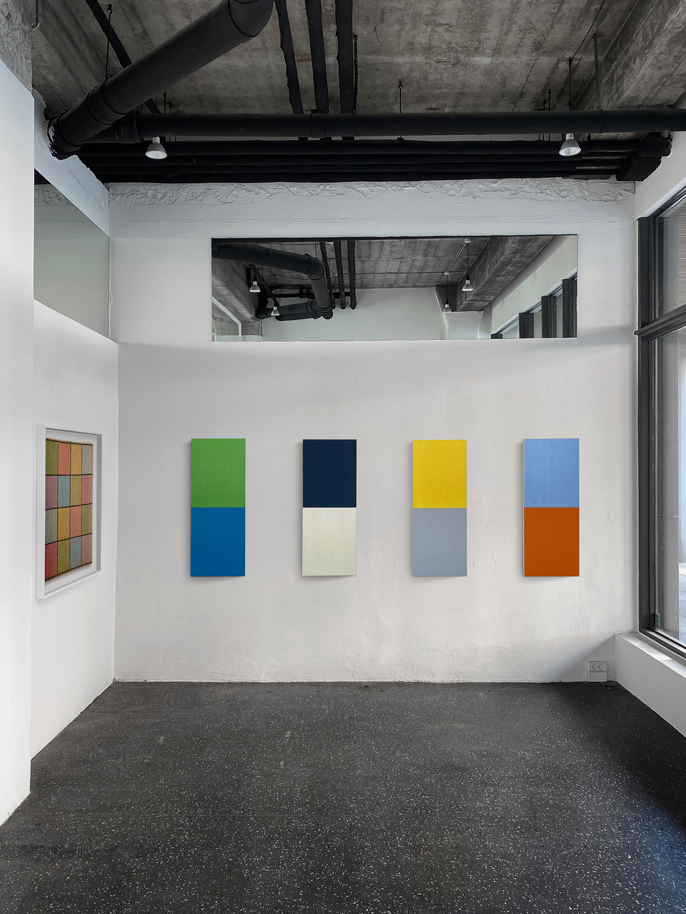
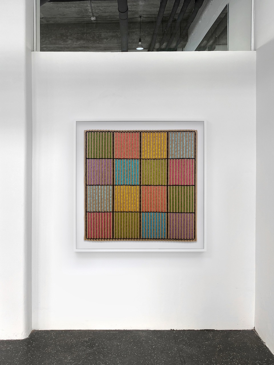
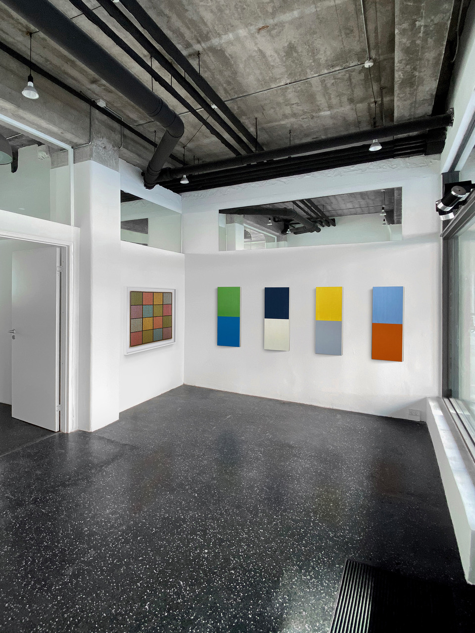
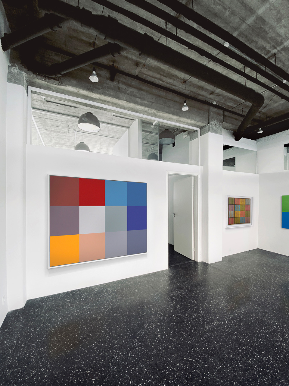
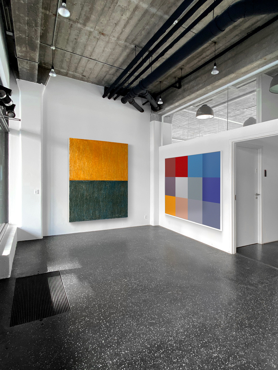
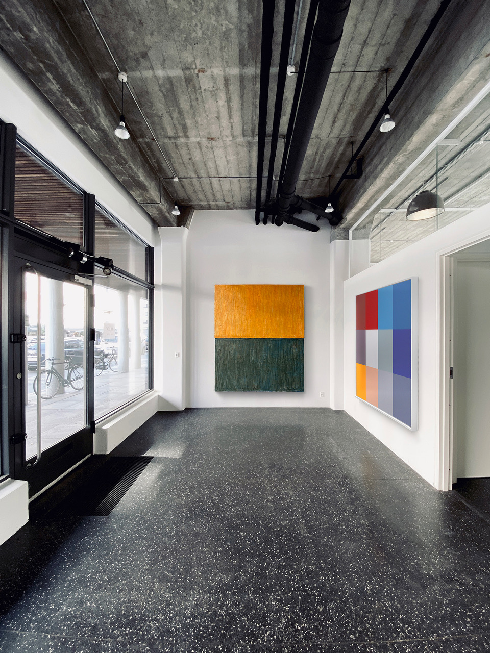
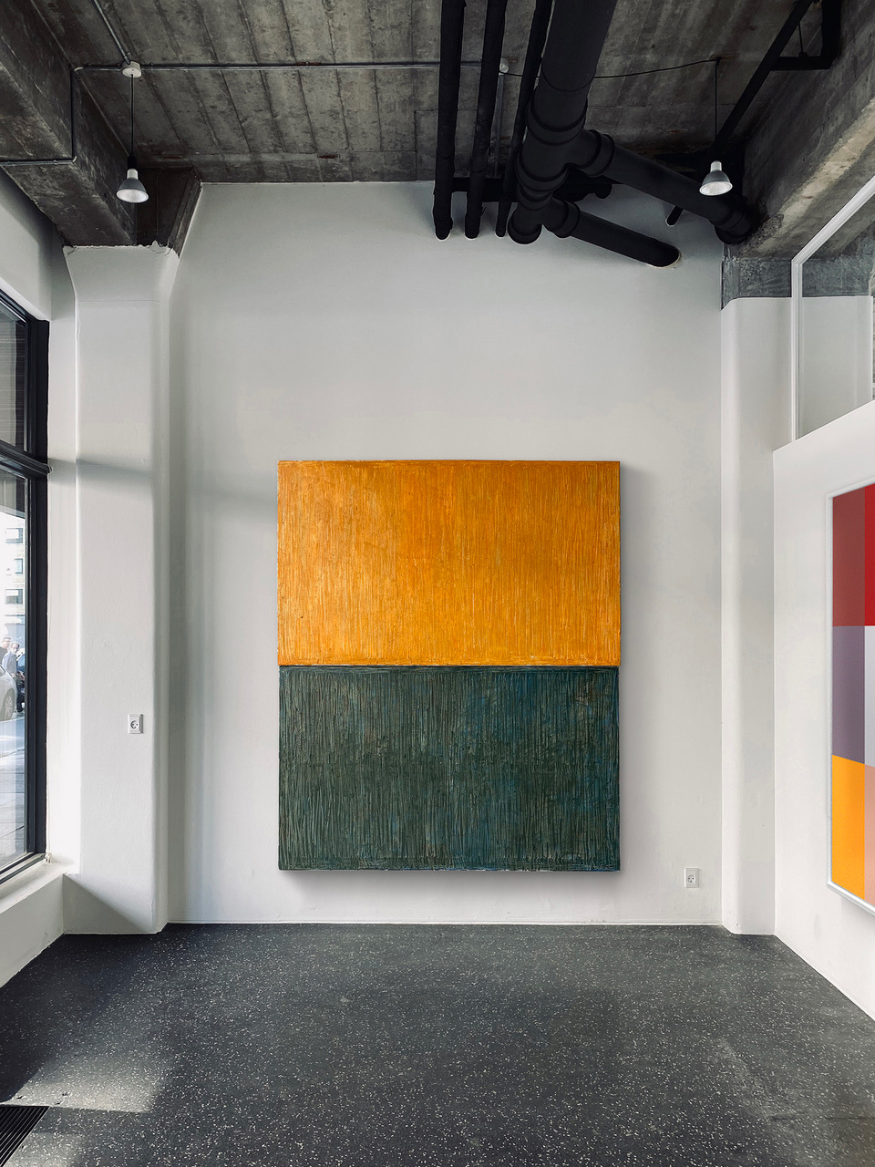
In order to support the everyday life of our artists during this pandemic, we sell prints!
You have the choice* of the artworks you want. The prints are made on a A3 format, Digital Laser Color printed on white paper of 120g/m2.
1 A3 PRINT COSTS 25.- CHF/EUR/USD** THE ARTIST/THE OWNER RECEIVES THE TOTAL AMOUNT OF 15.- CHF/EUR/USD**
IMPORTANT INFORMATIONS : READ CAREFULLY
*ALL BOOKS FEATURED ON THE WEBSITE ARE NOT ELIGIBLE. *WE CAN NOT ASSURE THAT THE PRINTED VERSION OF YOUR CHOICE IS AVAILABLE BECAUSE WE HAVE TO CHECK FOR THE RIGHTS OF REPRODUCTION WITH THE ARTIST/OWNER FIRST! **SHIPPING INCLUDED
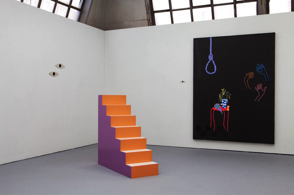
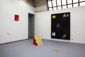
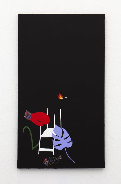
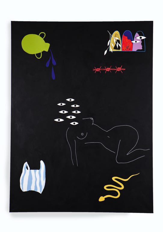
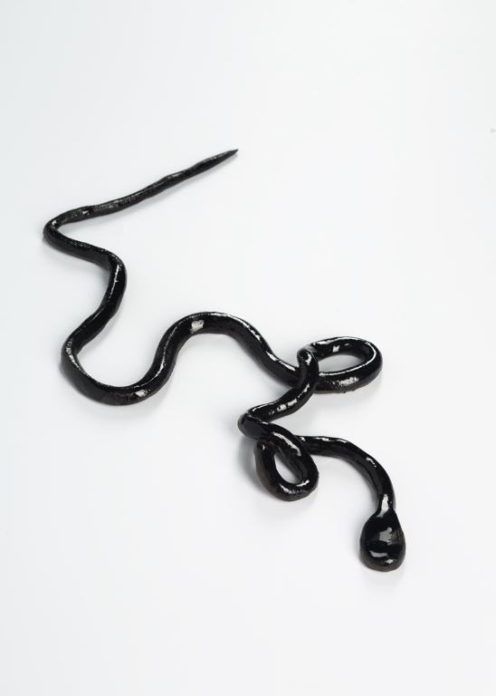
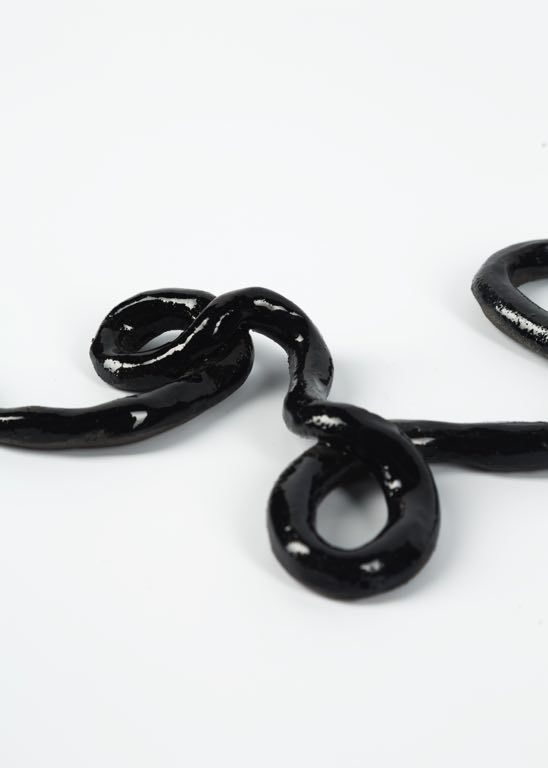
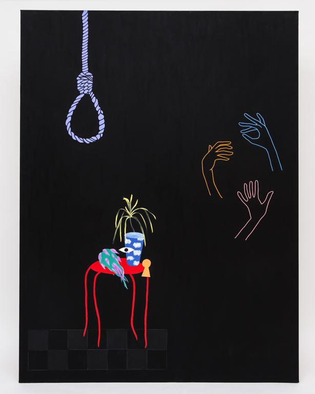
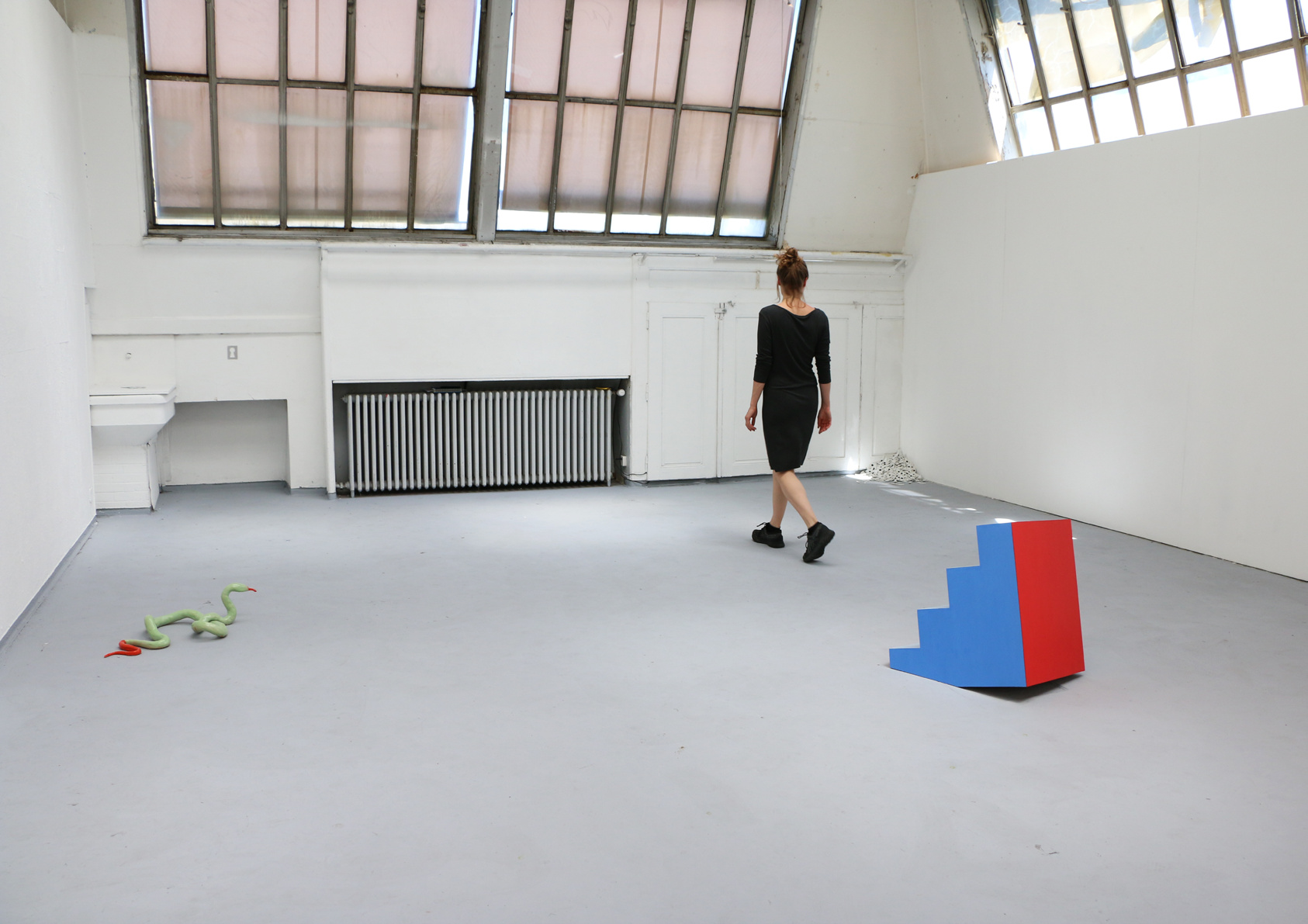
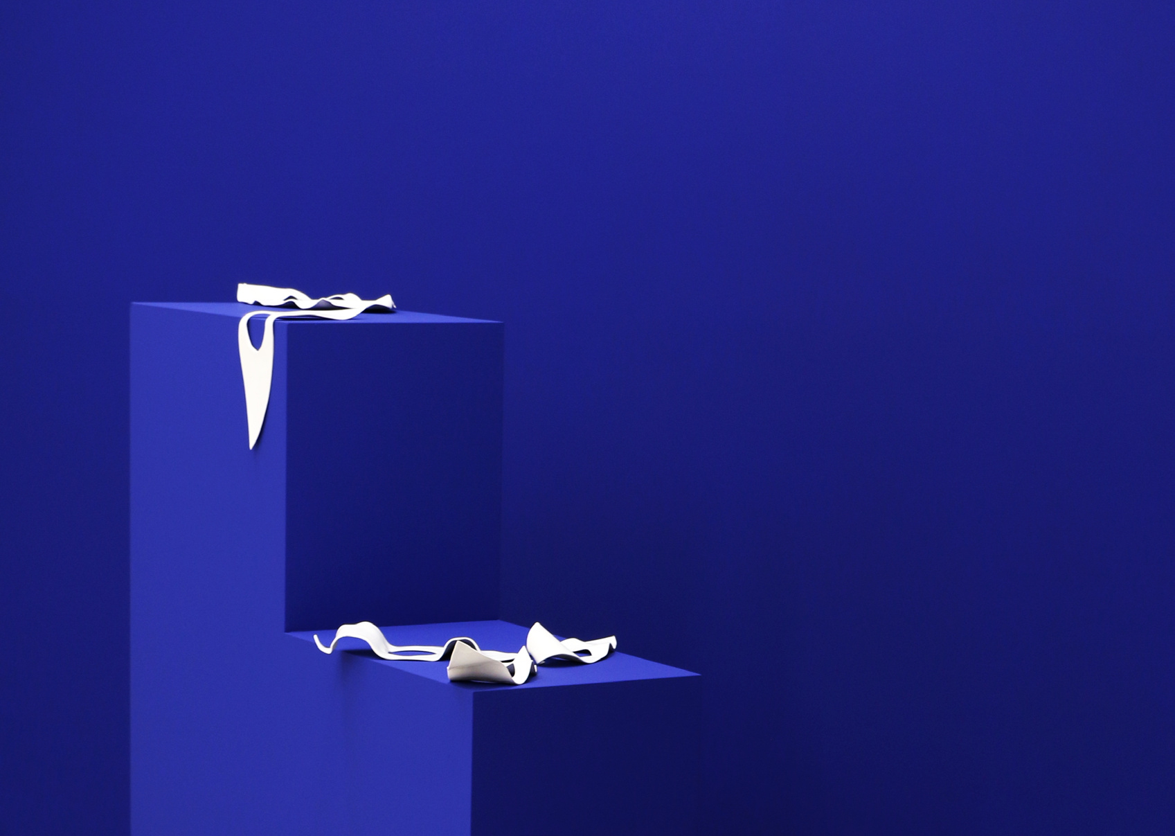
Emma Rssx, b. 1996 in Bordeaux, France, currently living and working in Geneva, Switzerland. After graduating from a transdisciplinary bachelor across art, science, politics and linguistics, Emma Rssx pursued her studies in visual arts at HEAD – Genève. It is through installations – composed of painting, ceramic, video, sound and text – that her work questions the confined of the frame we call reality. By composing in space with elements as one would compose a sentence with words on a page, Emma Rssx aims to create open and non-linear narratives, in order to deviate the potentiel and possible futures.
« My work explores the notion of space. be it the flat surface of the canvas or the room you call home. the physical and emotional space of the body, from sheltering womb to the width of the city you live in. space understood as an architecture in which you evolve and create by shaping and reshaping. space as a ground also, on which we communicate, with ourselves, and others. from sonorous poems to the deconstruction of words into noise, my work is very much language-based as a starting point. to this materiality and sonority of the text unfurls a dream-like narrative, where shapes, colours, touch, sound and movement erupts. »
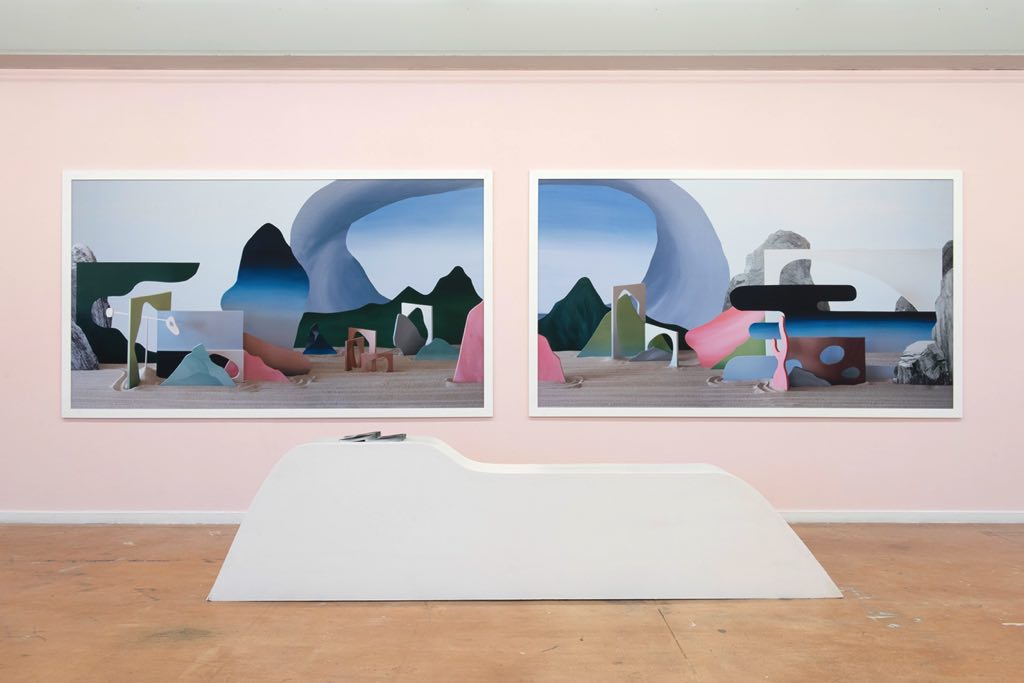
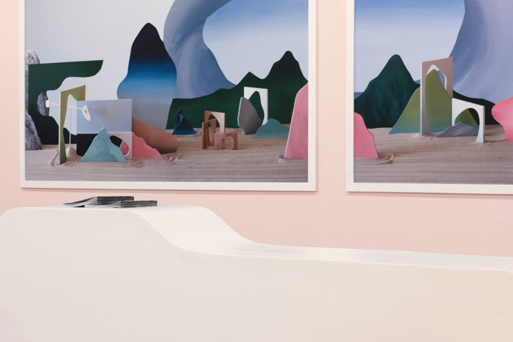
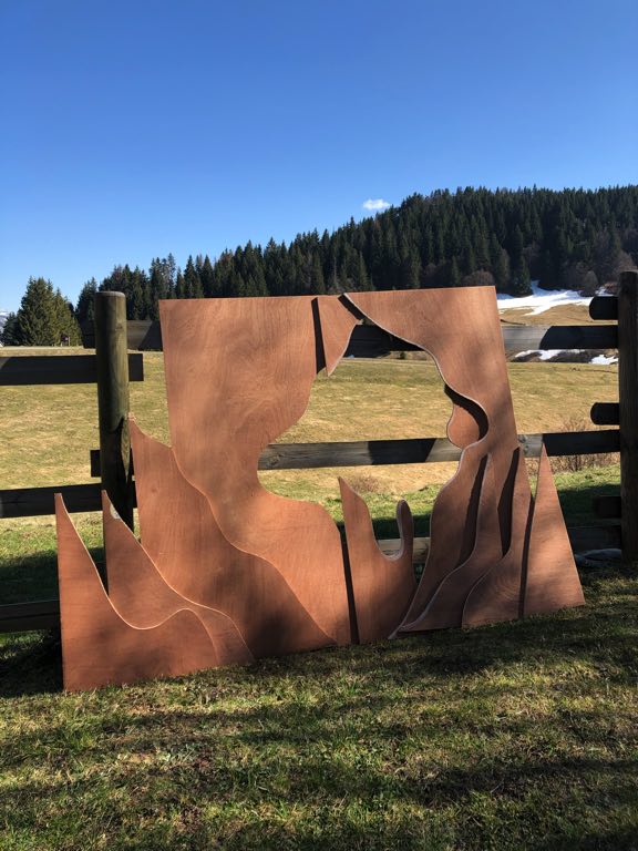
My name is Mina Albespy, I am 22 years old and I am half French and half Japanese. Although I grew up in the French Alps, I spent every summer of my childhood in Japan, which has had a great influence on my artistic practice and the themes that I approach today.
Living in the countryside between fields, mountains and alpine pastures, I developed a particular interest in landscape and its representation. Instinctively, it is through photography that I tried to take part in these great spaces. At the age of 18, I went to study photography for four years at ECAL/Ecole cantonale d’art de Lausanne in Switzerland.
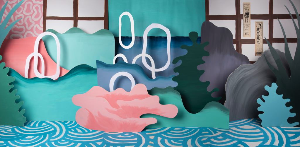
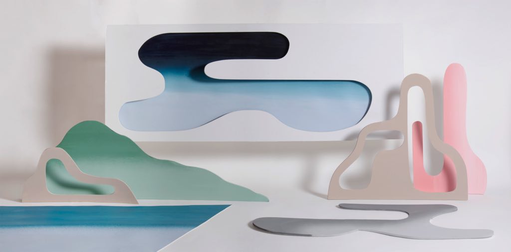
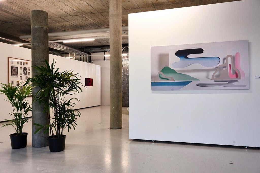
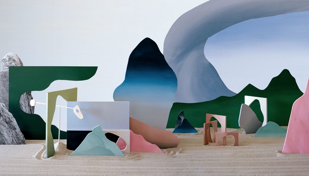
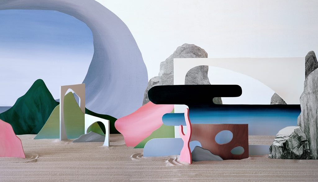
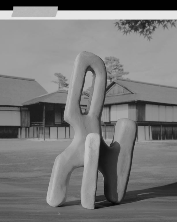
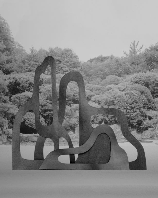
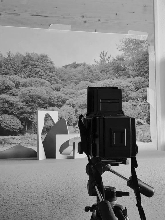
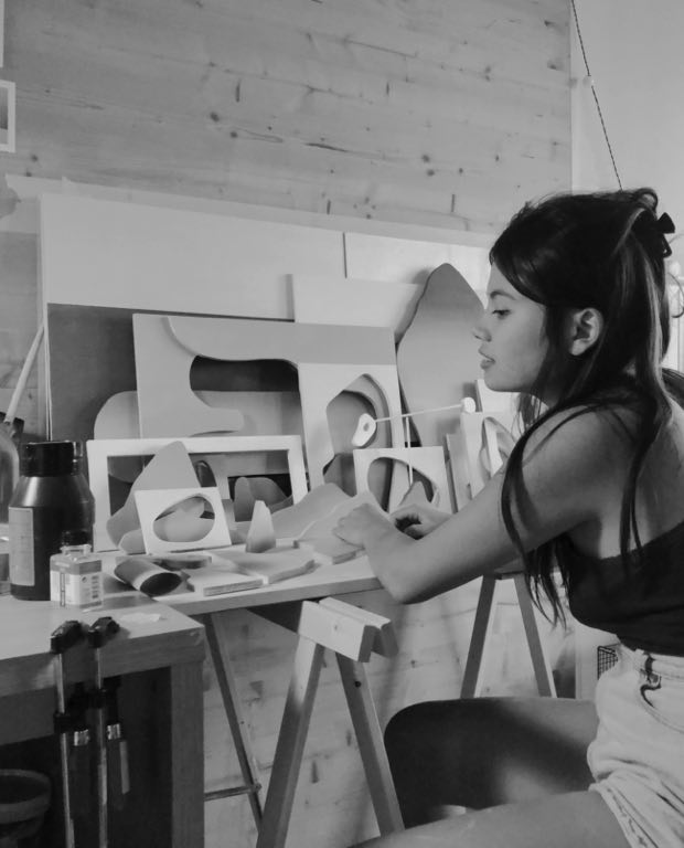
Very quickly, my interest turned more to what was happening on the other side of the camera than to the shooting itself. In a completely unconscious way at that time, I remember spending hours manually reconstructing landscapes that had marked my childhood and then re-photographing them afterwards. I would make models up to three meters long in my room from cardboard, paper and paint.
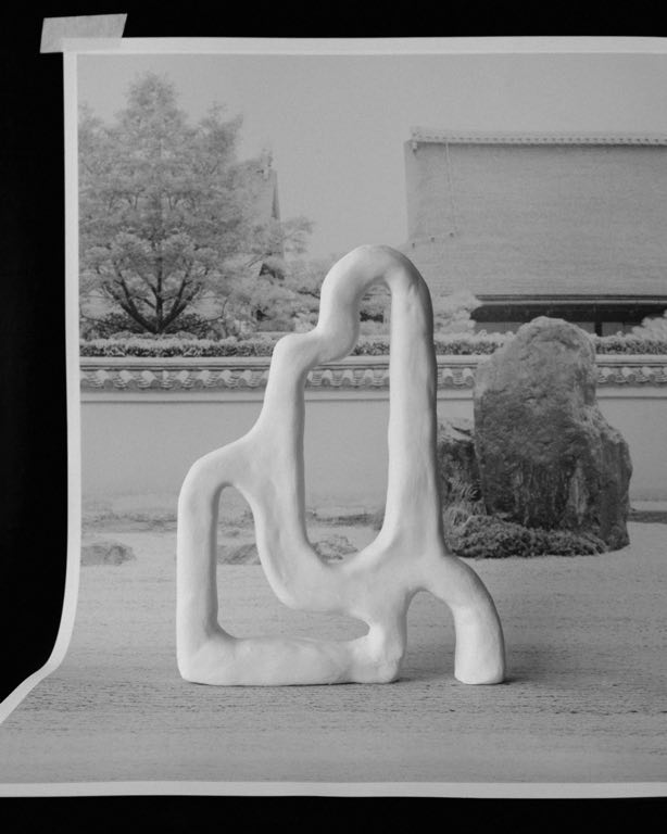
Two years ago, I traveled to Japan, notably to return to the Kyoto gardens which have been the subject of my numerous visits since I was little. As a child, the meaning of these gardens escaped me. However, I was deeply marked by their mysterious calm and the invisible force that made them radiate in silence. Even today, the feeling that runs through me every time I look at them remains the same. Whether in rainy weather or in intense heat, what I like to call the soul of these gardens always leads me to that same state of perfect satisfaction that I find difficult to put into words.
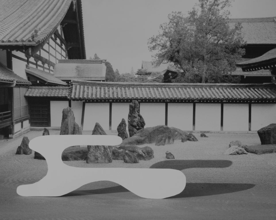
Empty and silent, these gardens are often nothing more than simple expanses of gravel with rocks and moss on either side of the enclosure. They tell non tales and yet they are heavy with a potential meaning that goes far beyond what is physically present, something impalpable and obscured by what is shown. It is a place where emptiness stimulates our imagination, where rocks become mountains and gravel becomes an ocean. It is in the emptiness of these gardens that I saw the French mountains of my childhood.
By appropriating the concepts of the Zen garden, I began a long work of formal and colorimetric research echoing the alpine pasture on which I grew up and the Japanese print. From the void, forms were born that I sculpted, painted, then photographed in a personal garden where sometimes, the full forms dialogue with the counter forms, taking up the idea that a stone is defined by its material but also by the space that creates it. After this long process of work, comes that crucial moment when everything comes to life, this moment when through the photographic act I immortalize this ephemeral scene where the space of a moment, reality and fiction become one.
At a time when we let ourselves be carried away by the tyranny of speed, it is more and more difficult for us to slow down, to observe and to be satisfied with the landscapes that have marked the rhythm of our childhood. As Isamu Noguchi, a famous Japanese- American sculptor once said : « We are a landscape of all we have seen ».
Perhaps we should slow down to finally contemplate the landscape that we are to invent something new for ourselves, and therefore for the world.
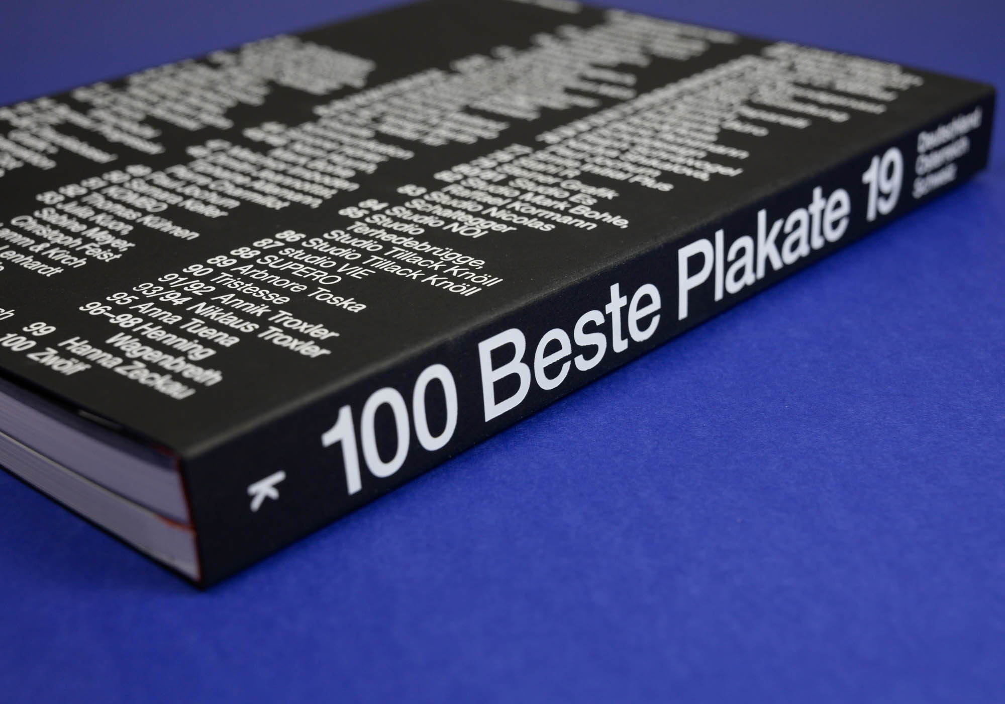
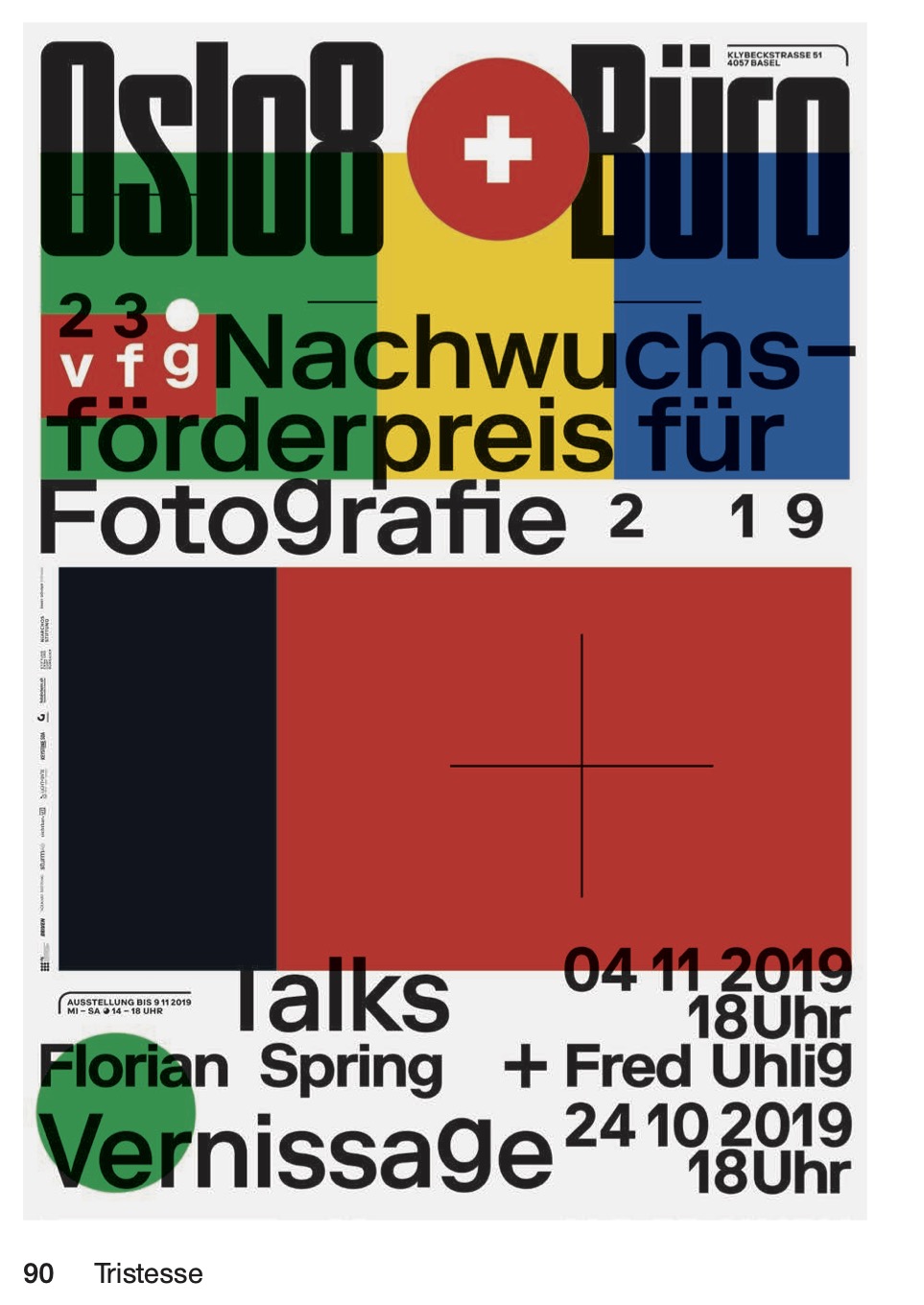
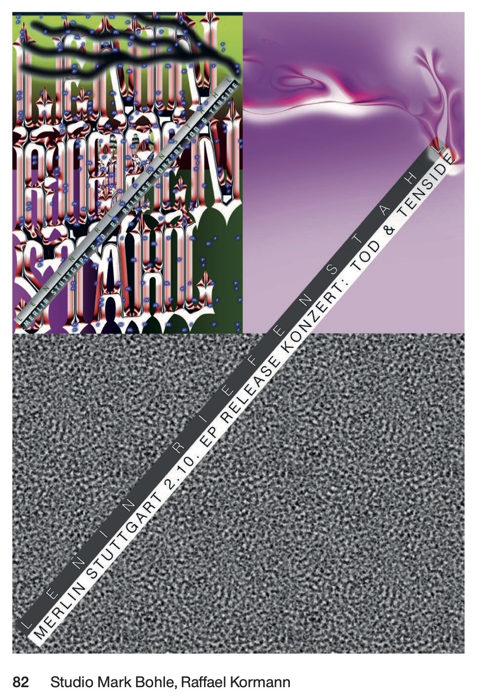
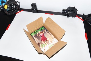
Mit allen 100 Gewinnerplakaten und serien in ganzseitigen Farbabbildungen und Textbeiträgen von Fons Hickmann und Julia Kahl – sowie Mark Bohle, Barbara Büscher und Joachim Büthe, Maurin Dietrich, Markus Dreßen, Jesko Fezer, Nils Güttler und Niki Rhyner, Stefan Guzy, Michael Hagner, Anna Lena von Helldorff, Christian Hoffelner, Jakob Kirch, Oliver Klimpel, Liebermann Kiepe Reddemann, Arne Linde, Stefan Marx, Hannes Mayer, Britta Peters, Marc Ries, Konrad Renner, Ursula Schöndeling, Max Stadler, Rebecca Stephany, Axel Töpfer, Helmut Völter, Susanne Weiß, Jan Wenzel und Laura Helena Wurth
Selection of posters by Hannah Grandi-Glasberg
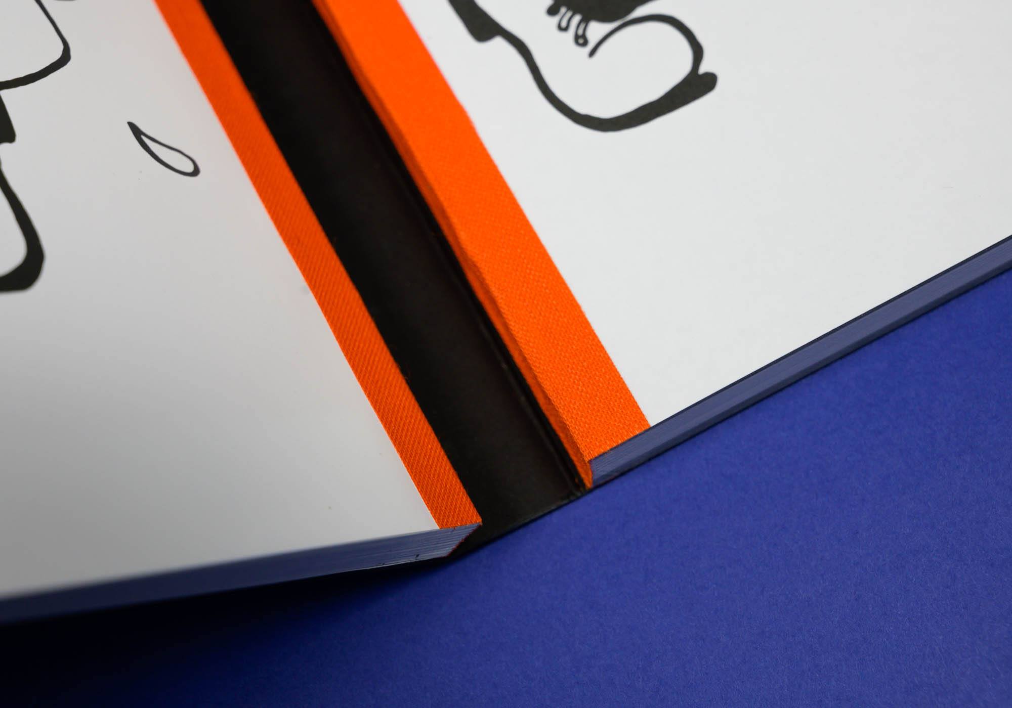
Deutsch/English, 17 × 24 cm, 332 Seiten, doppelte Schweizer Broschur ISBN 978-3-86206-825-8,
Erhältlich im Buchhandel, den Ausstellungen und im 100 beste Plakate-Shop GET YOUR COPY 29,90 € Fotos : 100 beste Plakate e.V. / Designers
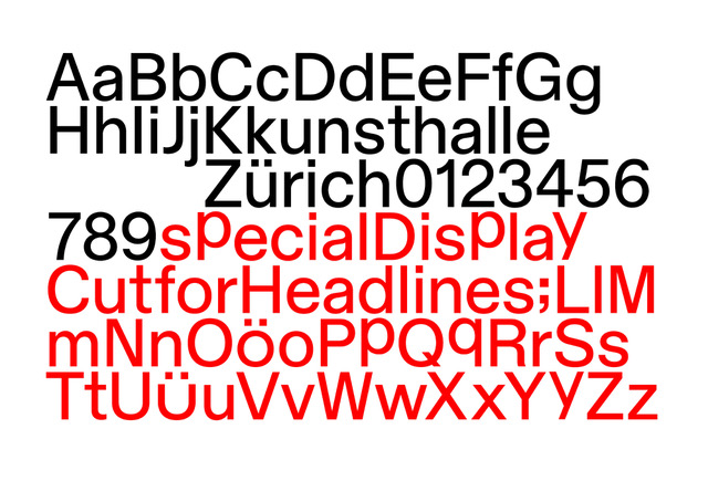
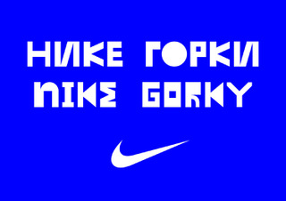
Dinamo is a Swiss type design agency that offers retail and bespoke typefaces, design software, research, and consultancy. We have spaces in Basel and Berlin, and satellite members in various other locations. Members of Dinamo are visiting teachers at various art academies and have been invited to give workshops and lectures at an international roster of educational institutions.
In 2017, Dinamo was awarded the Swiss Design Award by the Swiss Federal Office of Culture. In 2018, the foundry’s co-founders Johannes Breyer and Fabian Harb became members of the AGI. Dinamo has released more than 20 typeface families to date, and continues to oscillate between commercial and cultural projects.
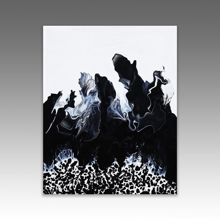
« I was once told that « boredom is your greatest enemy, » I often see and hear people say, « I’m bored. » We are all guilty of it from time to time. When using my hands to create something, the word boredom is never uttered; time flies, and days turn into nights. It is almost as if someone hit fast forward. One minute I am mixing my paint as the sun rises, and the next, I have missed dinner, a dozen texts, and a handful of phone calls. I would have it no other way. So I continue creating. »
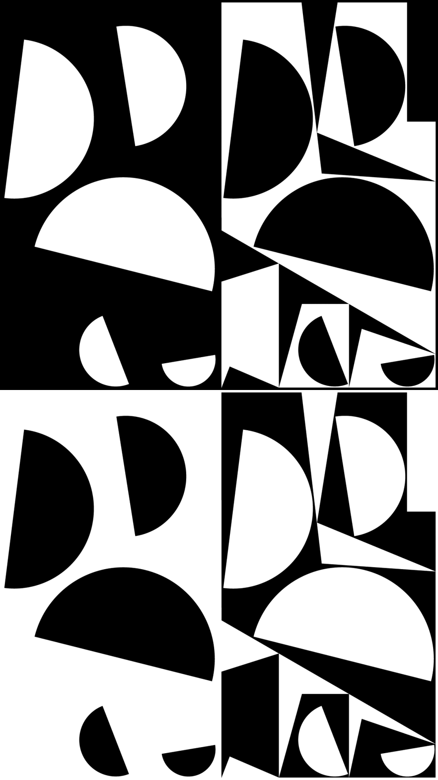
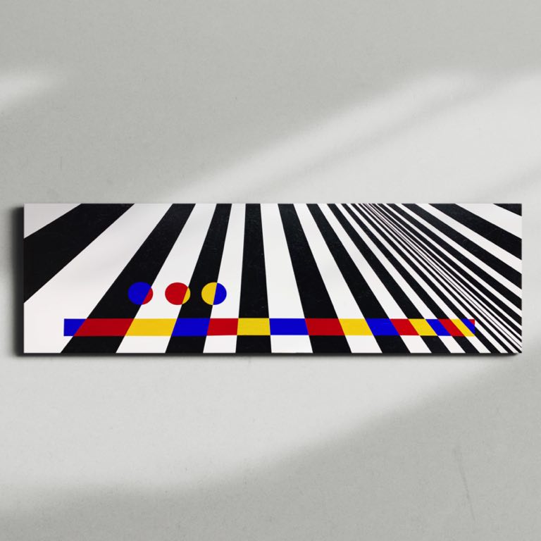
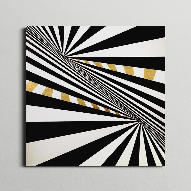
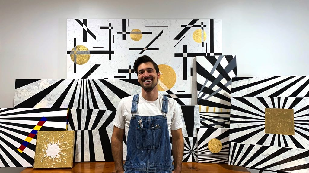
« I create because words are hard, and I can’t think of any other way to explain the images in my head, so instead, I paint them. » « Sam Wagner is a New York-based artist who focuses on shape and harmony of composition. His work attempts to stray away from the expected use of value and perspective to draw a childlike wonder from the viewer. Sam’s fascination with bold lines, hard edges, and technology can be seen in his primarily geometric abstract and Suprematism works. He hopes to create structure and clarity often unavailable in daily life. »
n/a
The Artist in front of the last series, October 2020
« I have studied traditional art, art history, and produced quite a few works of my own. Landscapes, portraits, still life, Neo-Impressionism, Neoclassicism, Post-Impressionism, but it never stuck. I was not too fond of the process, the rules, and, most of all, being told what to paint. I was always drawn to abstract art (De Stijl, Geometric Abstraction, & Neo-Plasticism) not because I found the profound meaning behind the work, but because it struck me, the feeling of grandeur, balance, and observational simplicity. Created a peaceful feeling that I strive to create in my work. »
Vince started to demonstrate artistic interest and skills from a very young age. The first artistic experiments were impulsionated by his grandmother, who discovered that the only way to settle down the restless child he was, consisted in telling him to draw, which he would quietly do for hours.Despite that, it was never in his plans to pursue an artistic career. He ended up following a different path so that his true passion remained hidden until very recently, waking up again with an enormous strength and clarity, showing him that art is what he was born and meant to do. Creating is a process through which he can access his imagination. By developing an idea and expressing it through an artwork, he creates a gateway that not only allows him to share that inner world of his with others but, most importantly, to let the outside world in. To him, abstract painting style feels like home. It’s the rawest and most direct way to channel what he intends to .The majority of his artistic influences comes from urban culture and the contemporary aspects of daily life. Organically, his style tends to vary between a more complex and a minimal approach, creating an intrinsic paradox. He gravitates towards the use of acrylic and spray paint, as well as other materials that allow him to build textures and distinct visual identities. As an artist, his goal is to create timeless portals that lead to different types of imaginary and he likes to think that those portals will forever be accessible to whoever wants to enjoy them »
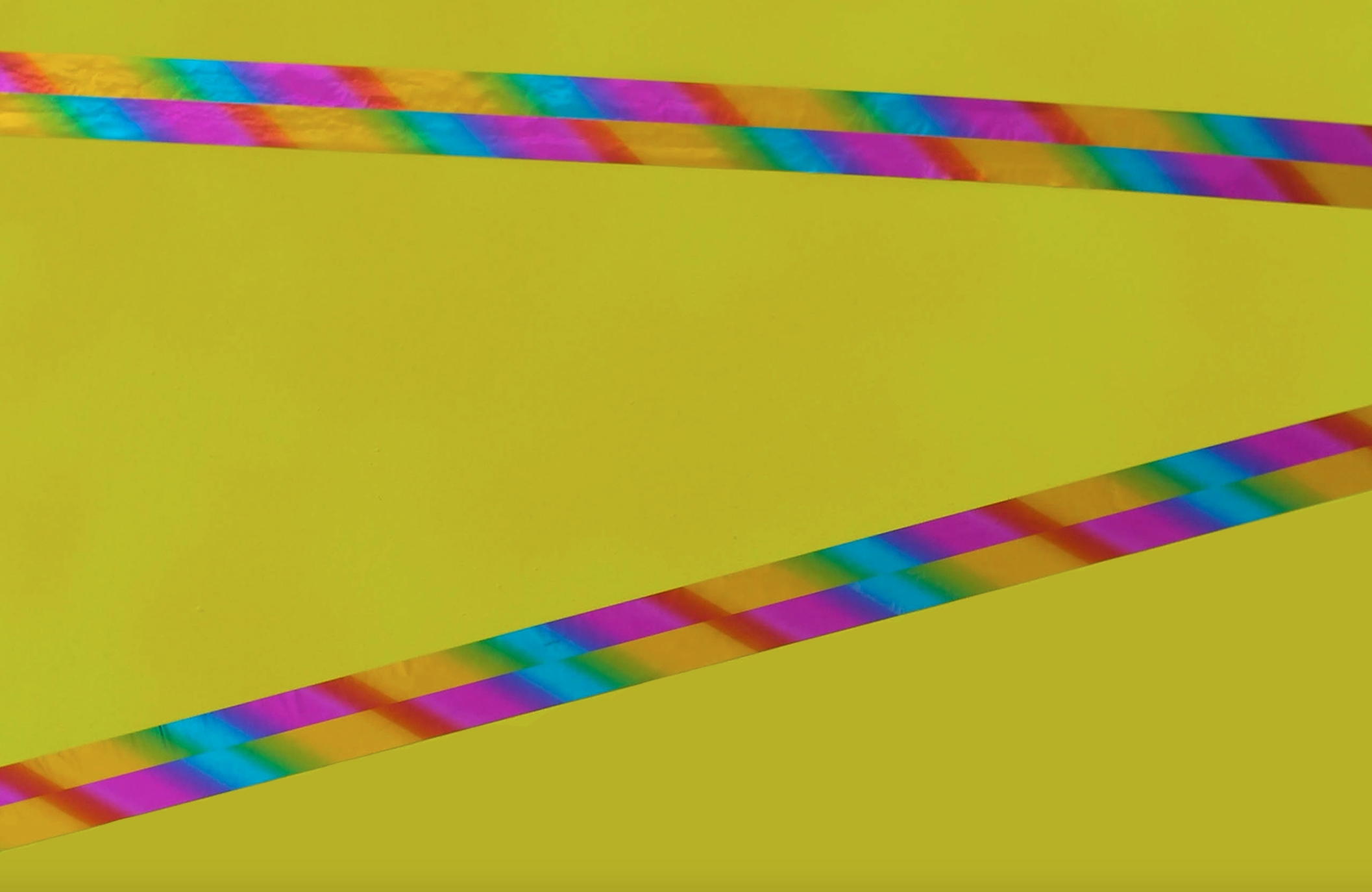
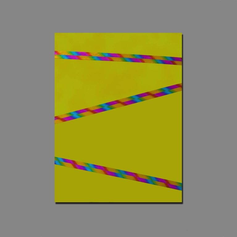
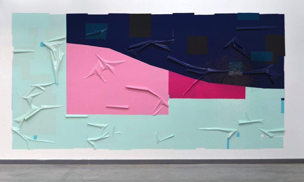
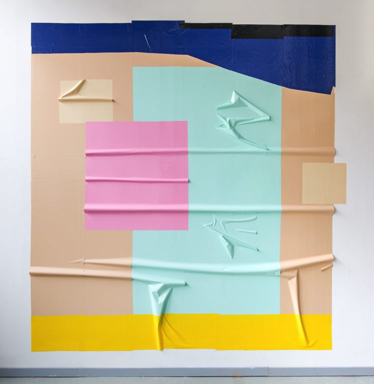
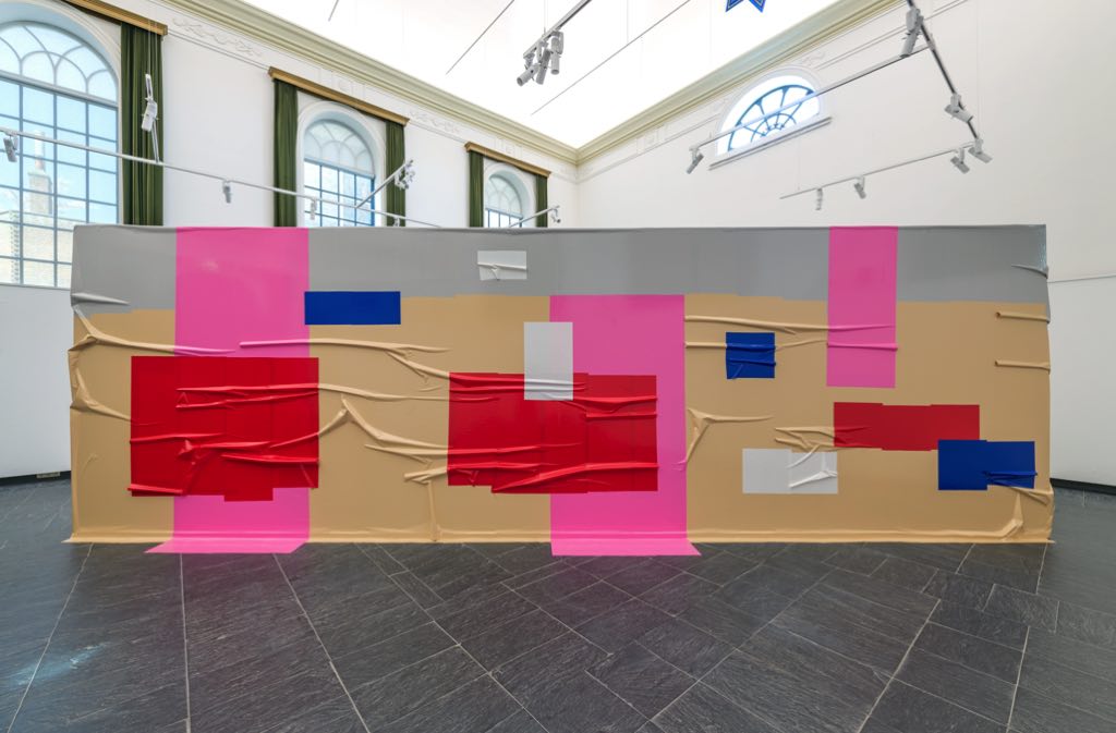
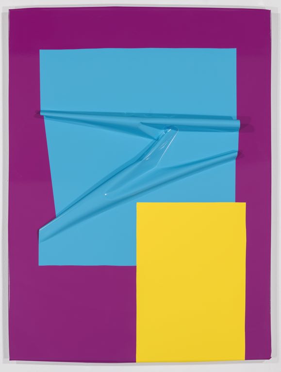
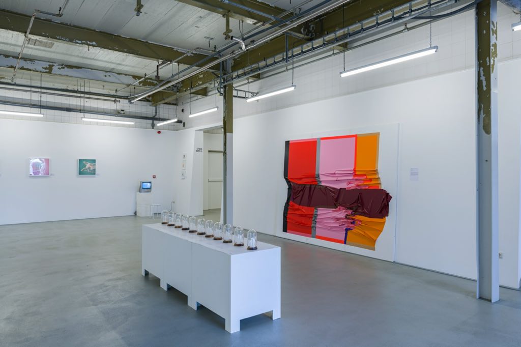
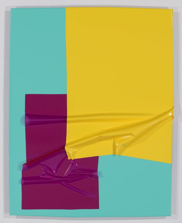
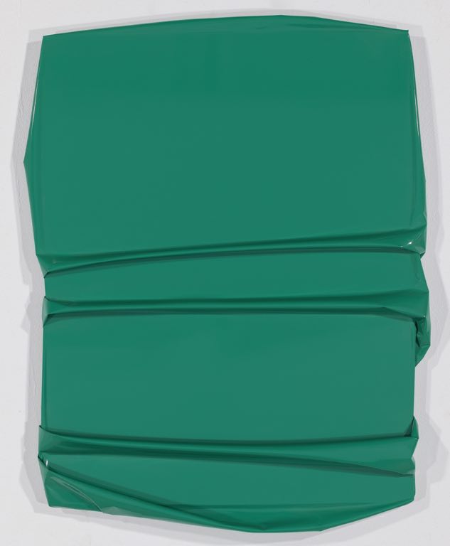
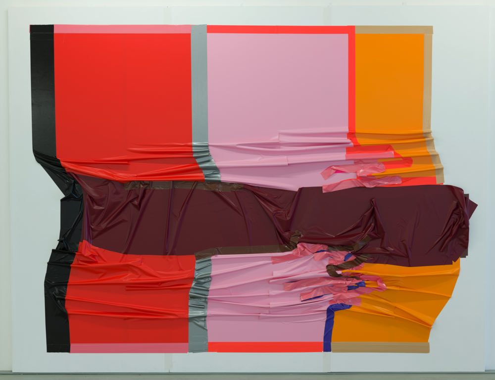
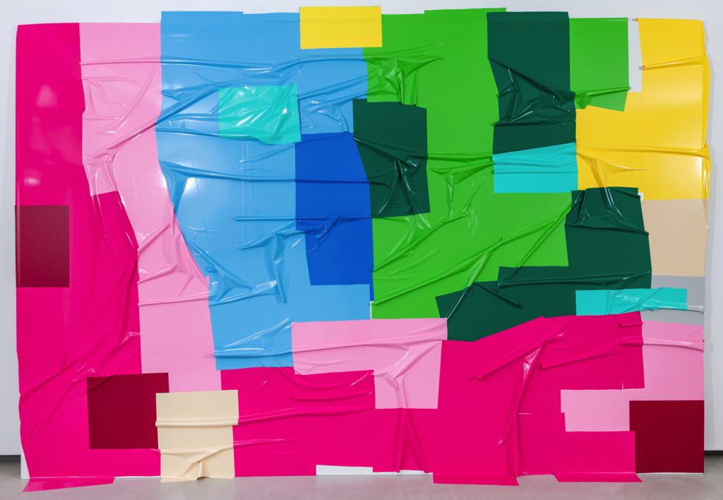
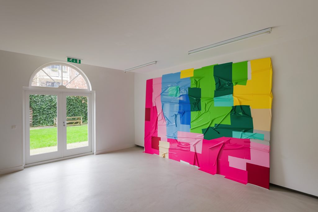
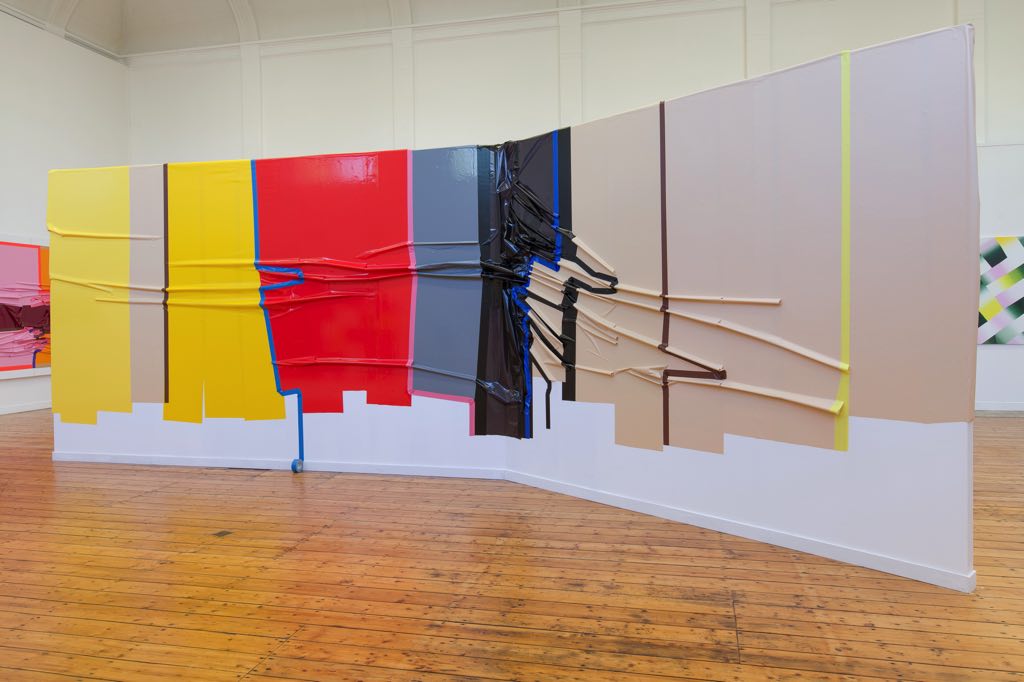
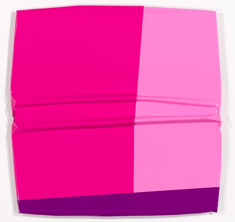
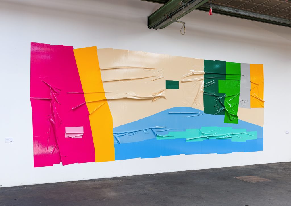
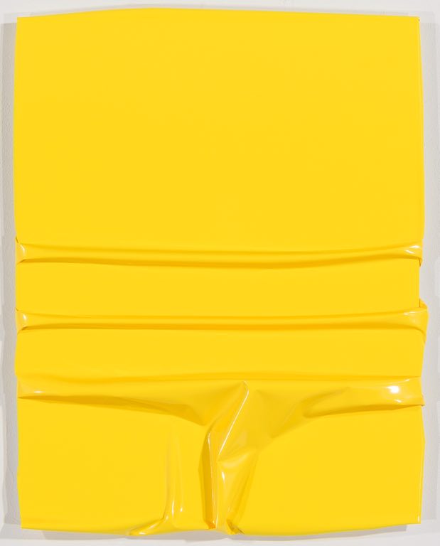
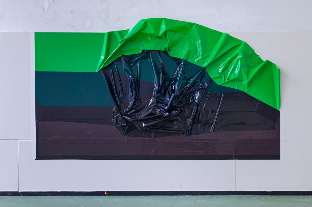
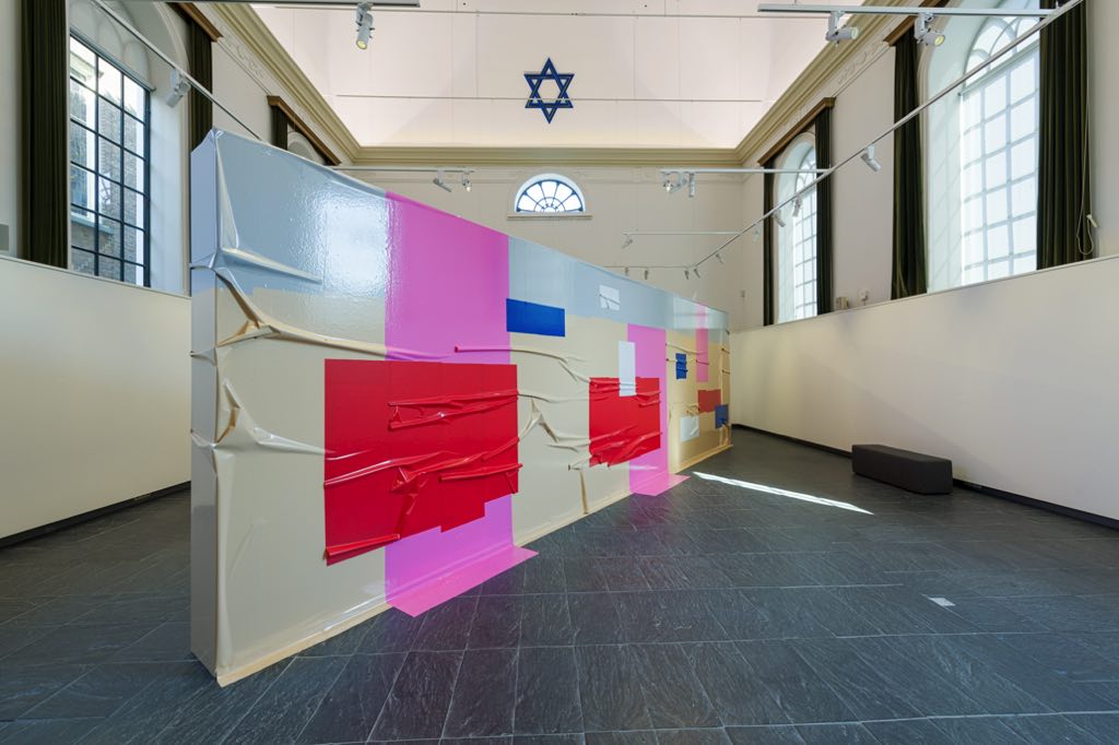
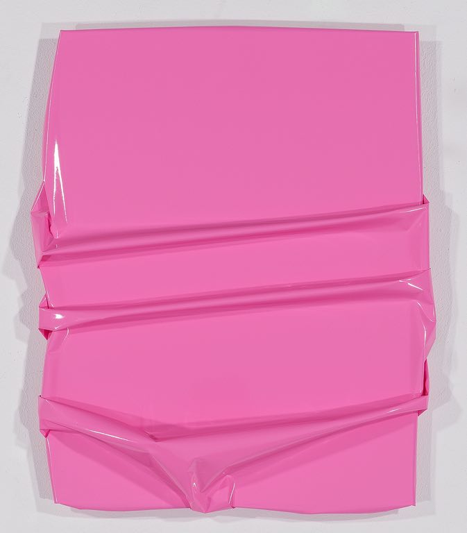
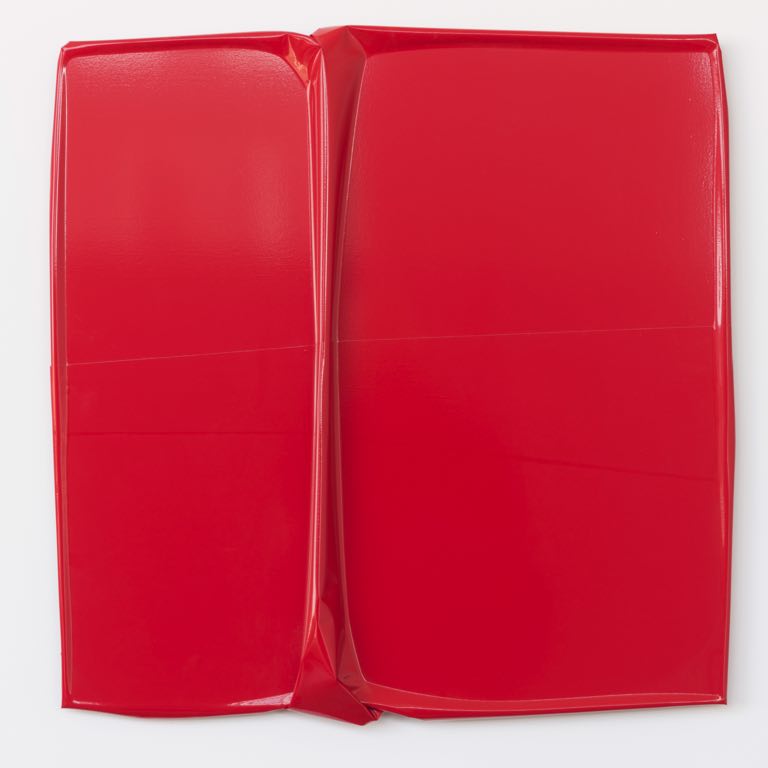
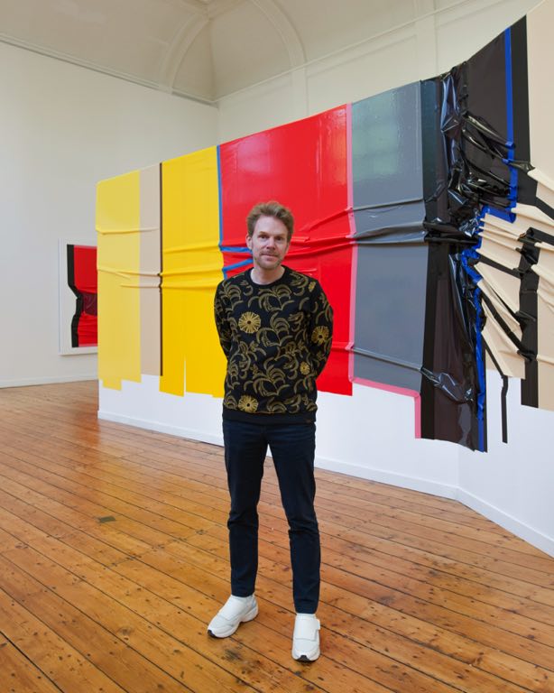
In his work Rotteveel explores the picturesque and sculptural qualities of foil and tape. He feels inspired by the hard-edge and color field painting tradition, among others. Rotteveel searches for the undefined boundaries between materials, dimensions (flat and volume) and high art and low art.
Rotteveel works both on dibond panels and directly onto the wall. His murals are temporary: after an exhibition has finished, Rotteveel takes them down and then they are gone forever. A statement to demonstrate that art should not necessarily hold eternity value, but that the true value is in the moment.